Projects
This section outlines activities that include commissioned public artworks, social practice and participatory public art projects. Brief descriptions and images are presented as an introduction to selected projects
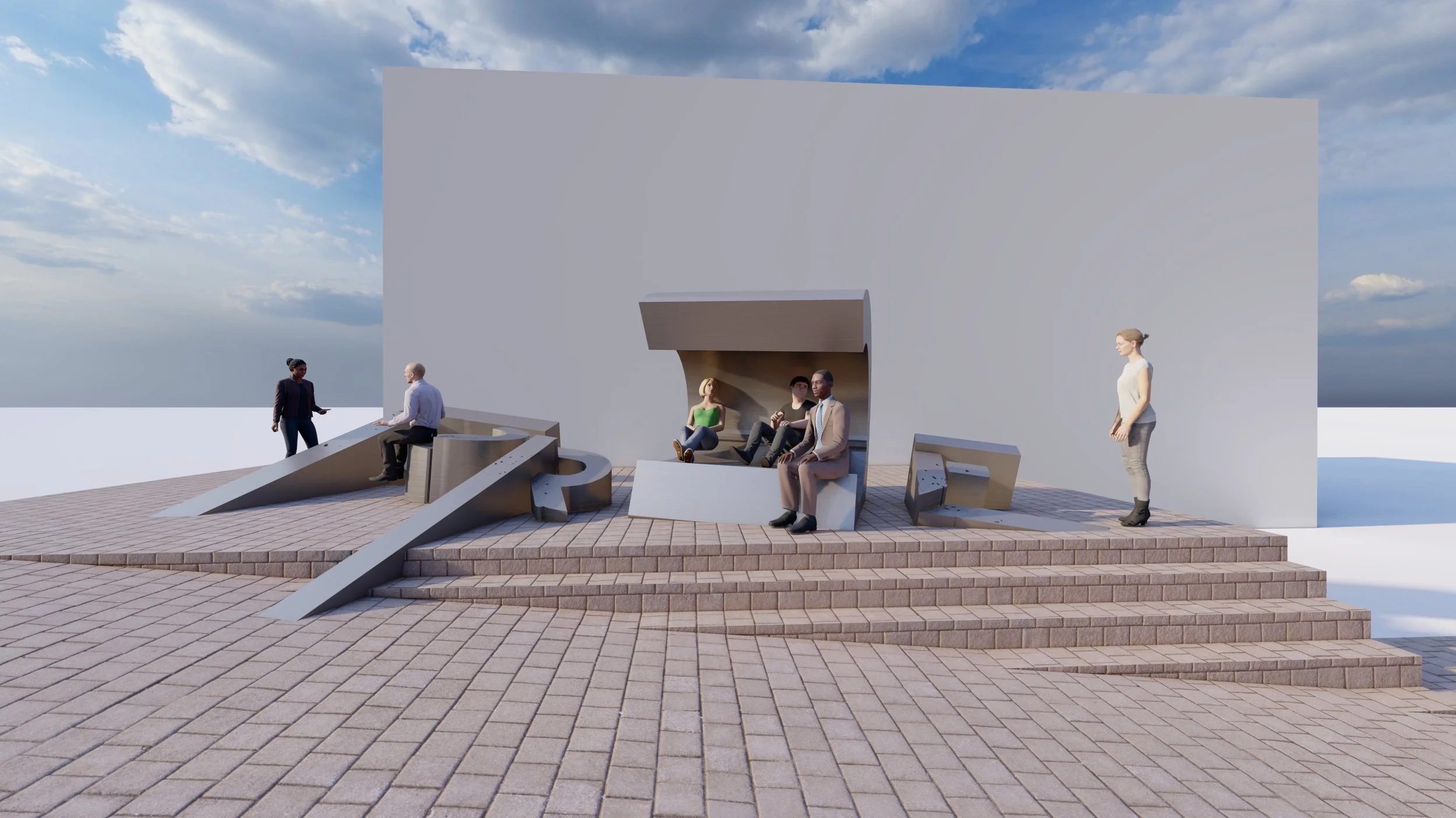
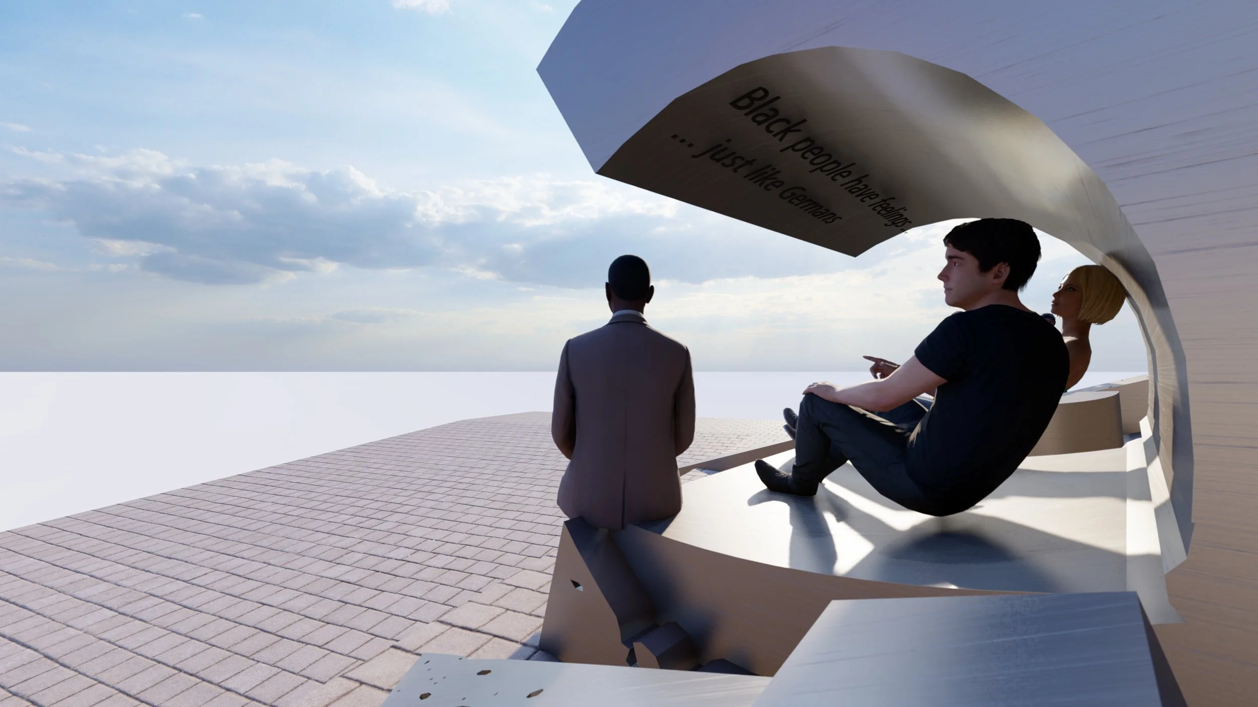
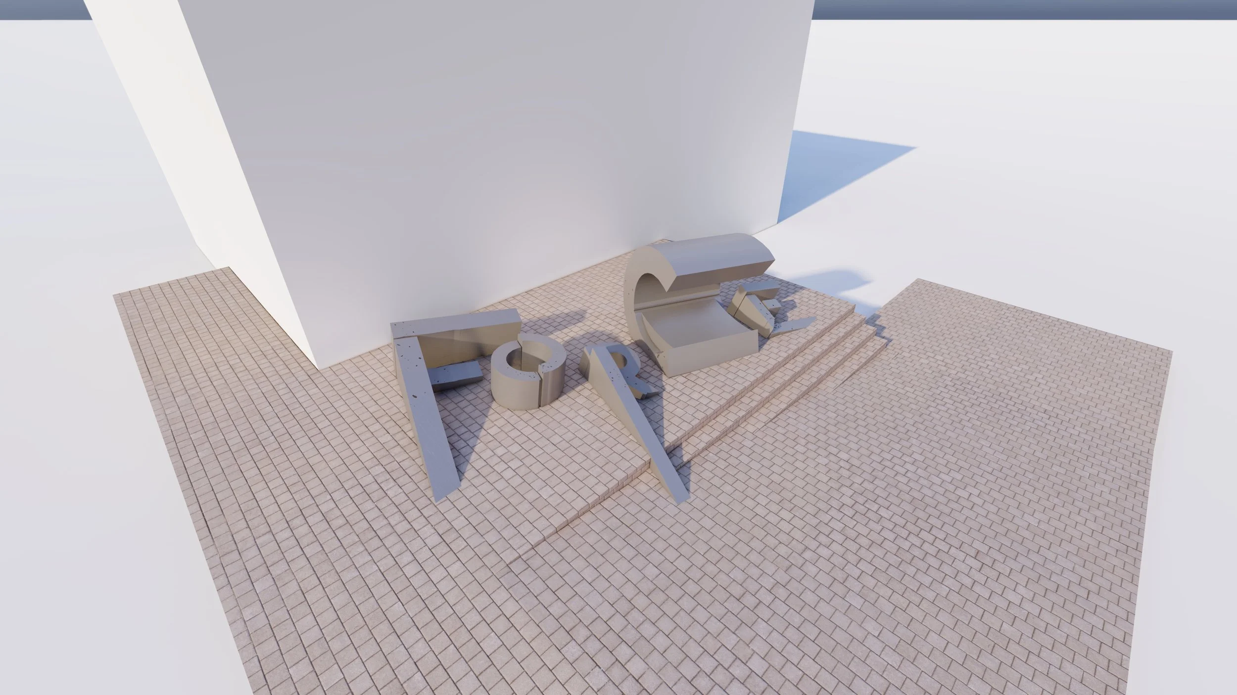
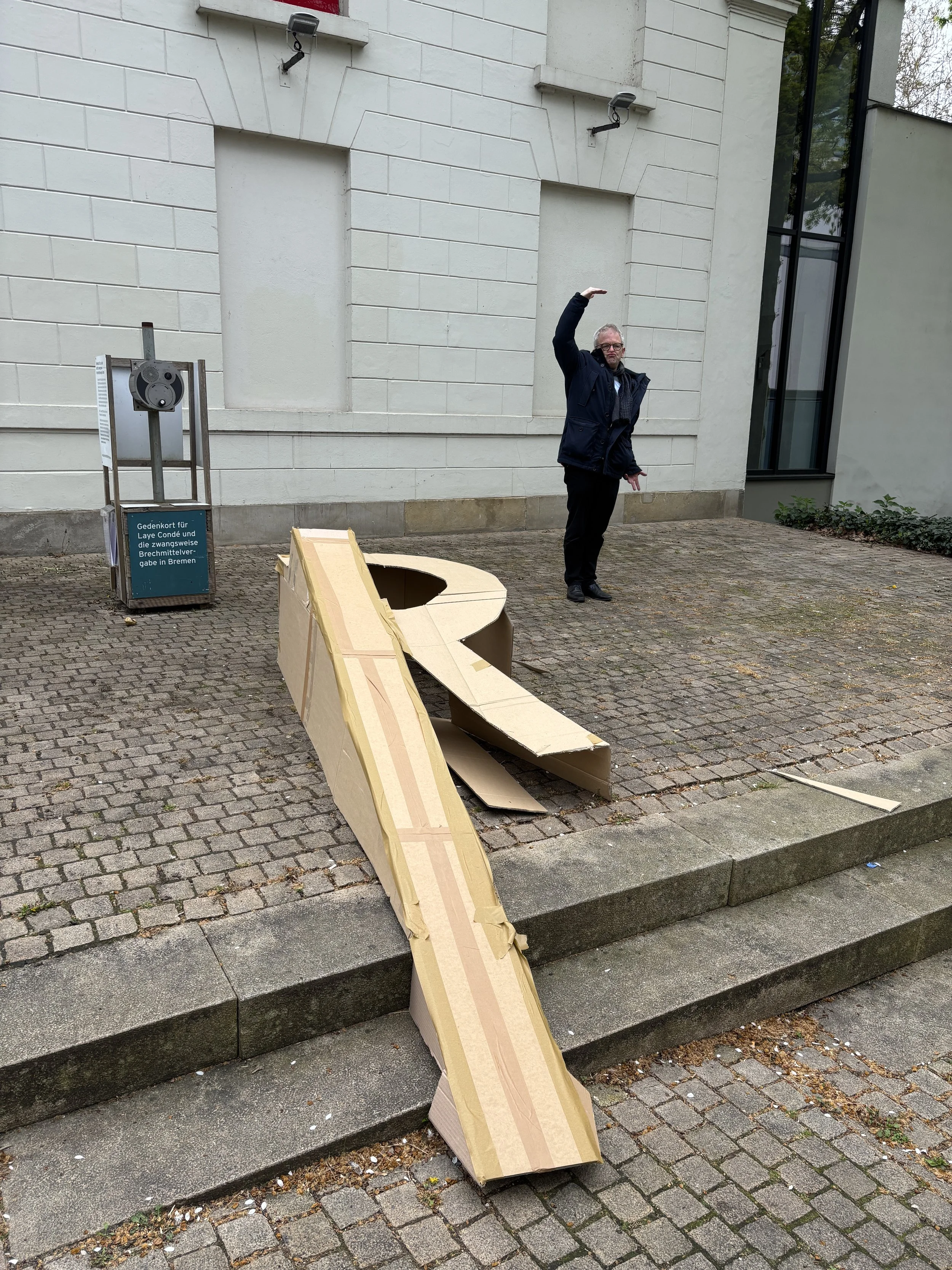
2024 - 2026, Death by Drowning, Bremen, Germany
The artwork serves as a memorial and brings awareness to the case of Laye-Alama Condé and the many black men who were subjected to the forced administration of emetics while in care of the state. Laye-Alama Condé died in January 2005, an asylum seeker from Sierra Leone, victim to police brutality in Bremen, Germany.
The concept of the memorial artwork is based on the word “force”. It relates to the forced administration of the emetic torture procedure, and the associated forced response of the body through vomiting. Force further relates to a sense of power and exertion. coercion and compulsion. I have purposefully used the English version of the word as opposed the German “Gewalt” because of the many references of the English word. For example, the force also refers to the police force. This reading is crucial as it speaks to current discourses around police brutality and anti-black racism.
The letters of the word are designed to create sculptural forms that are engaging. Thus, one can sit on the pieces. This is intentional to encourage an opportunity to ponder about the work and to dialogue. The seating however is not meant to be entirely comfortable. The letters slant, picking up on the occurrence of the existing slanting floor surface, but more consciously it is a strong reminder of the manner in which Laye-Alama Condé was killed. The individual pieces appear as if to be sinking or drowning. This ties in with the title of the artwork; Death by Drowning. The metallic surface is also not meant to be comfortable, as I want it to be cold in winter and hot in summer. The cold metal is a purposeful reference to the hospital-like bed that was used to administer the emetic.
As a site that addresses anti-black racism, the memorial is designed to be thought provoking, self-reflexive and encourage conversation and dialogue. The message of the artwork does not shy away from speaking to the brutality and reality of racism, human rights violations, power and control, while maintaining a deep sense of respect for the victims of emetic torture including Laye-Alama Condé.
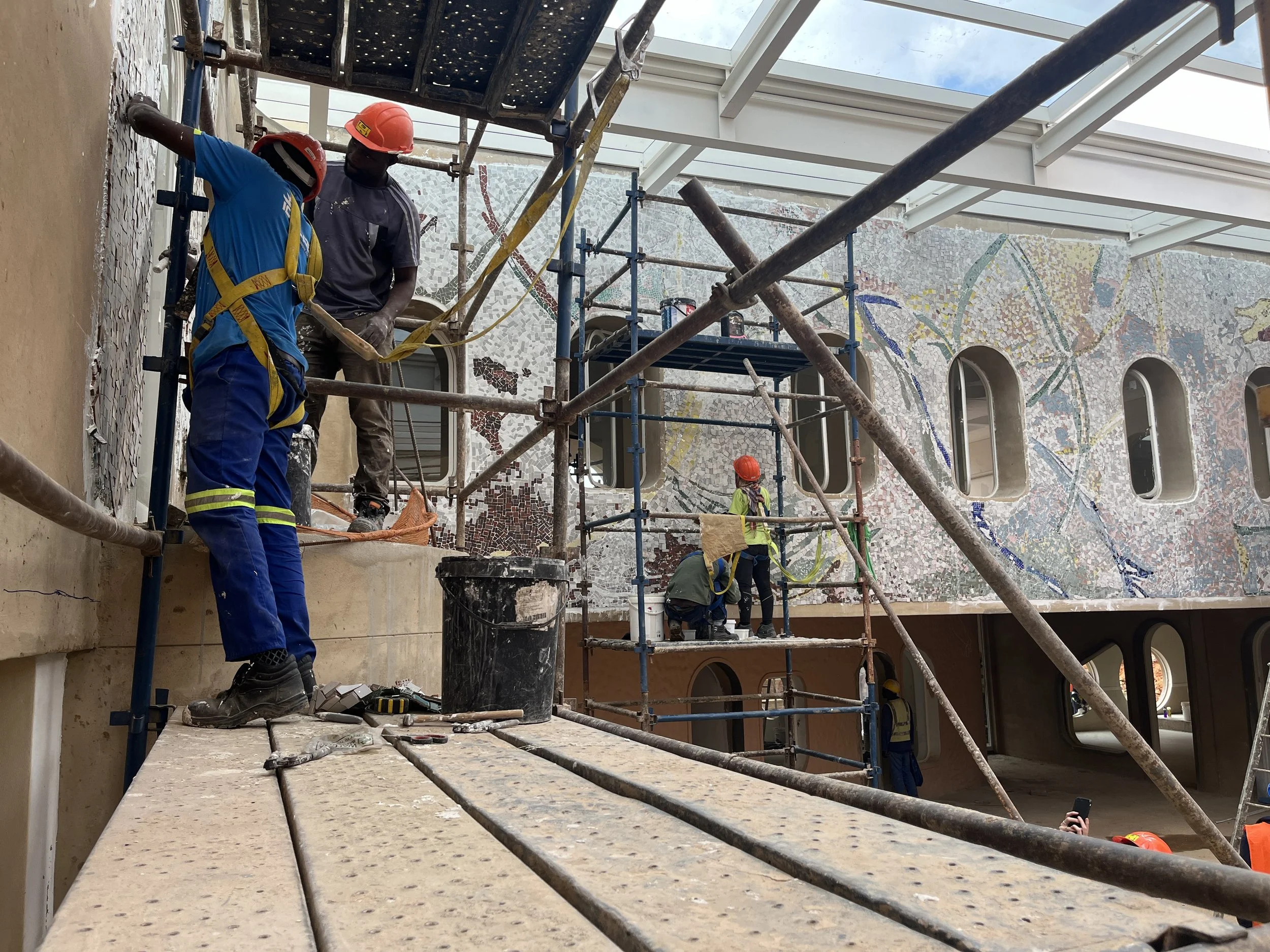
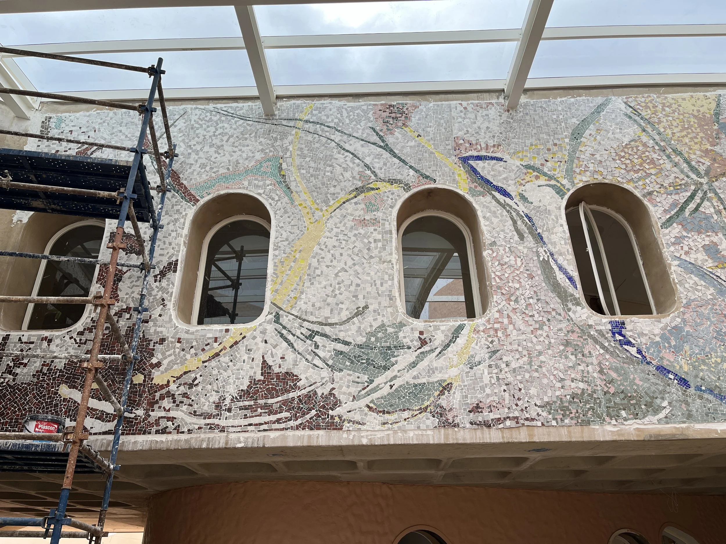
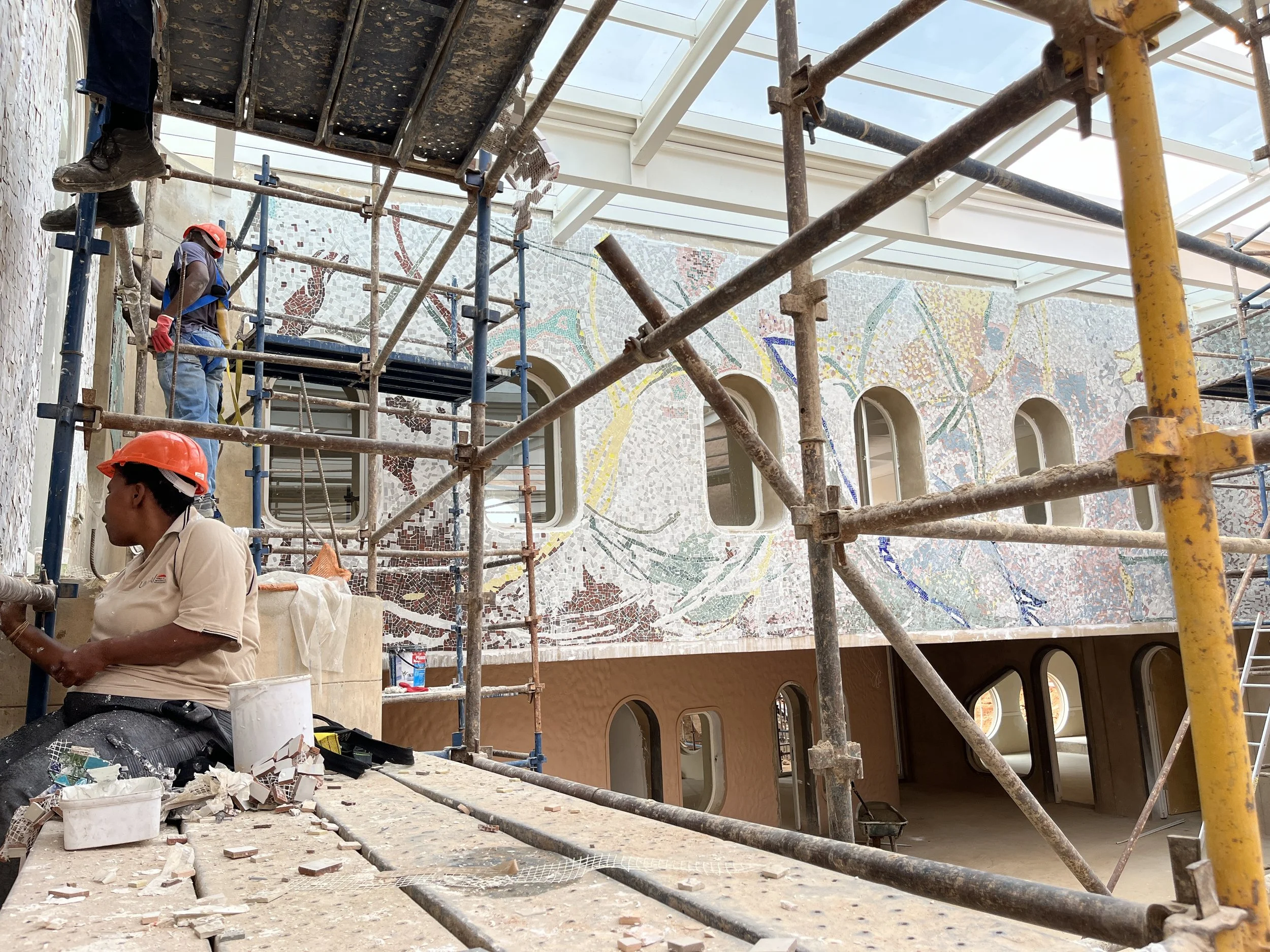
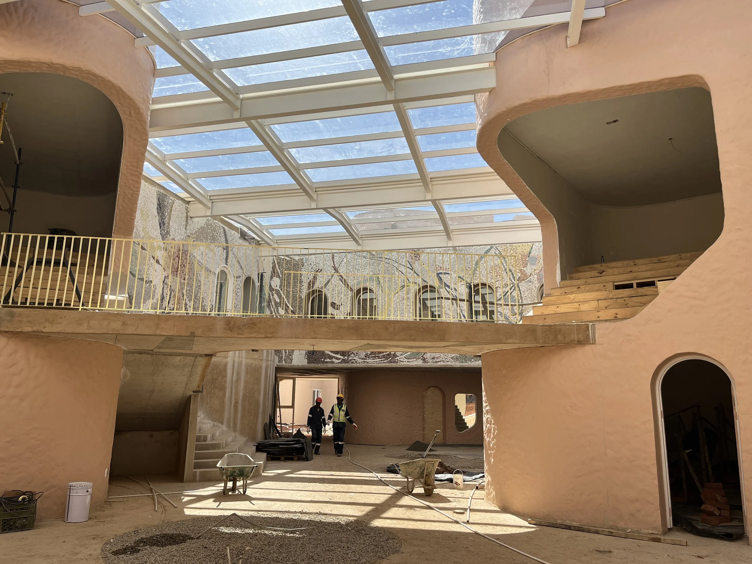
2022 - 2024, 100 Languages, Mosaic, Red Hill Pre-school, Morningside, Johannesburg, SA
A collaboration with Hubo Architects, this 154m2 mosaic was made in tandem with the construction of the new pre-school at the Red Hill school in Johannesburg. The design of the artwork synergizes with the architecture of the building. Both designs have purposefully employed the Regio Amelia teaching methodology as an approach. Thus, the image is intentionally non-prescriptive, the forms are suggestive and encourage the imagination.
The complete artwork took over a year in the making; 2 months of design informed by historical research into Regio Amelia, which interestingly includes a visit by OR Tambo to the Italian town, workshops held with the pre-school learners and teachers, 7 months of production with a team of 8 to 10 assistants and 12 weeks of installation.
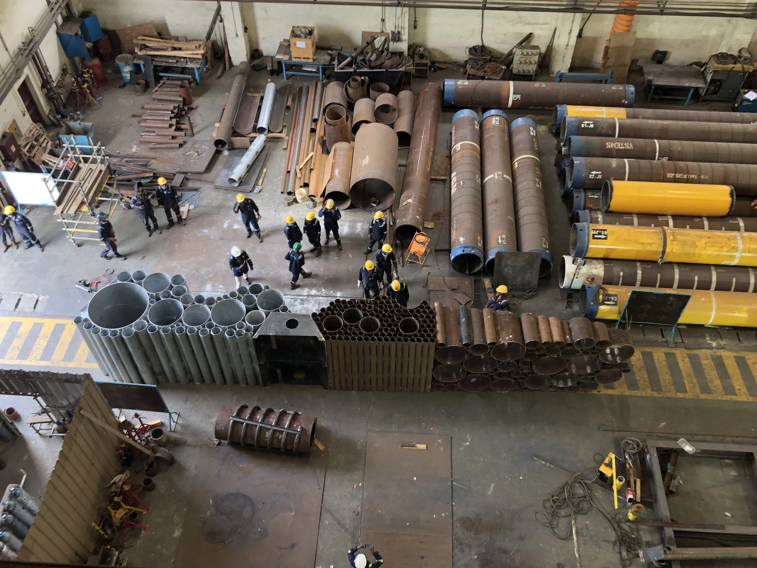
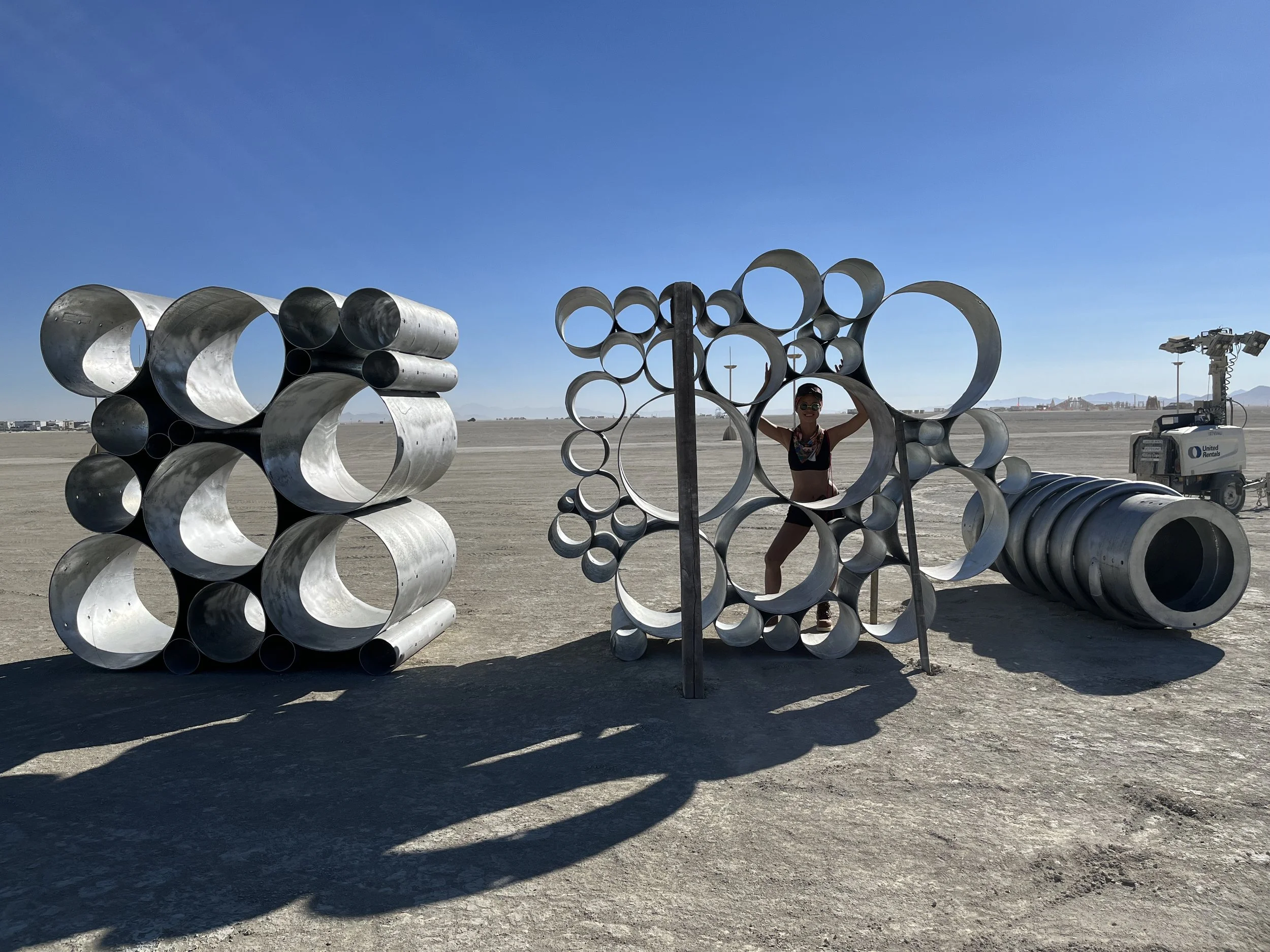
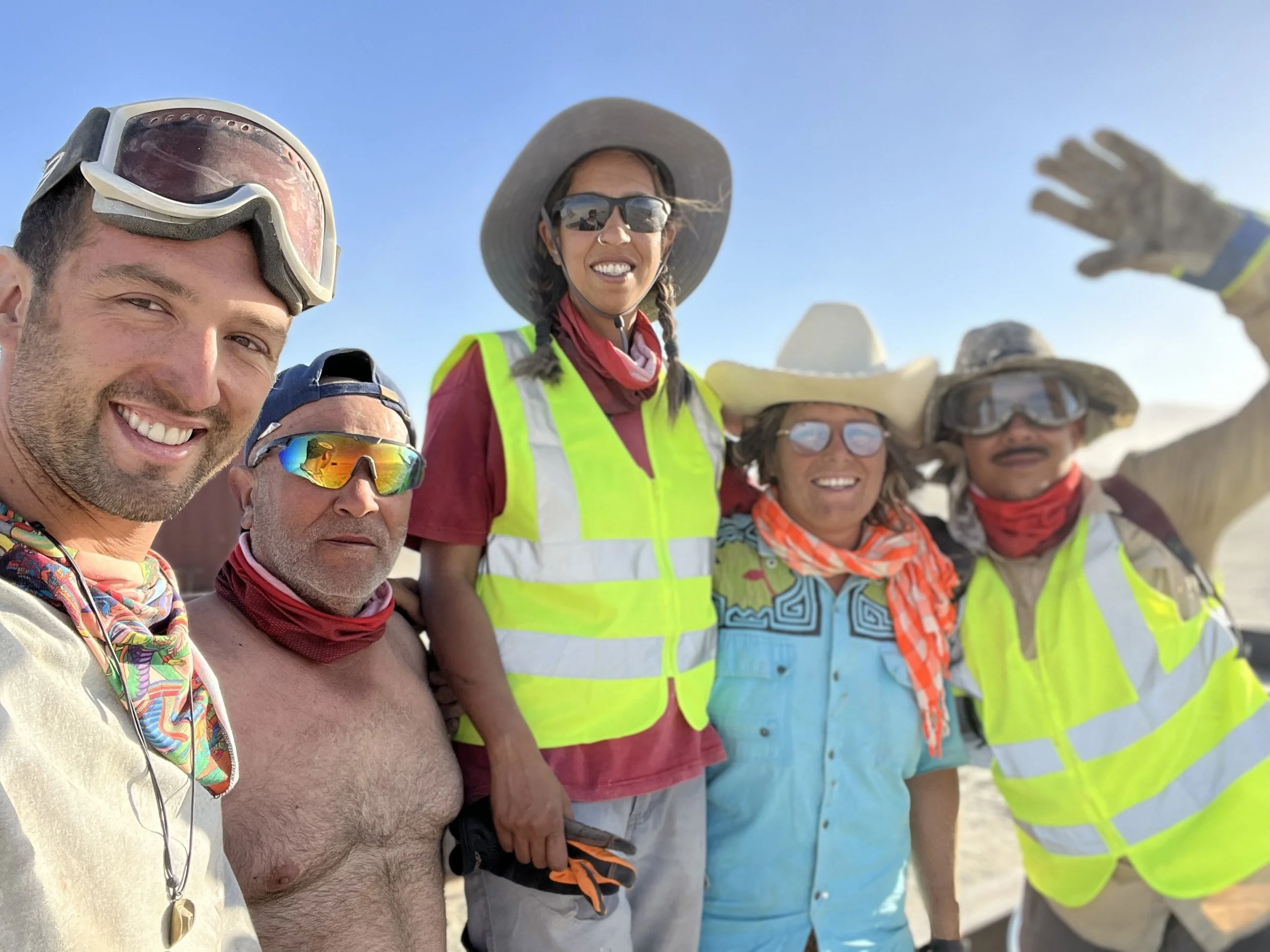
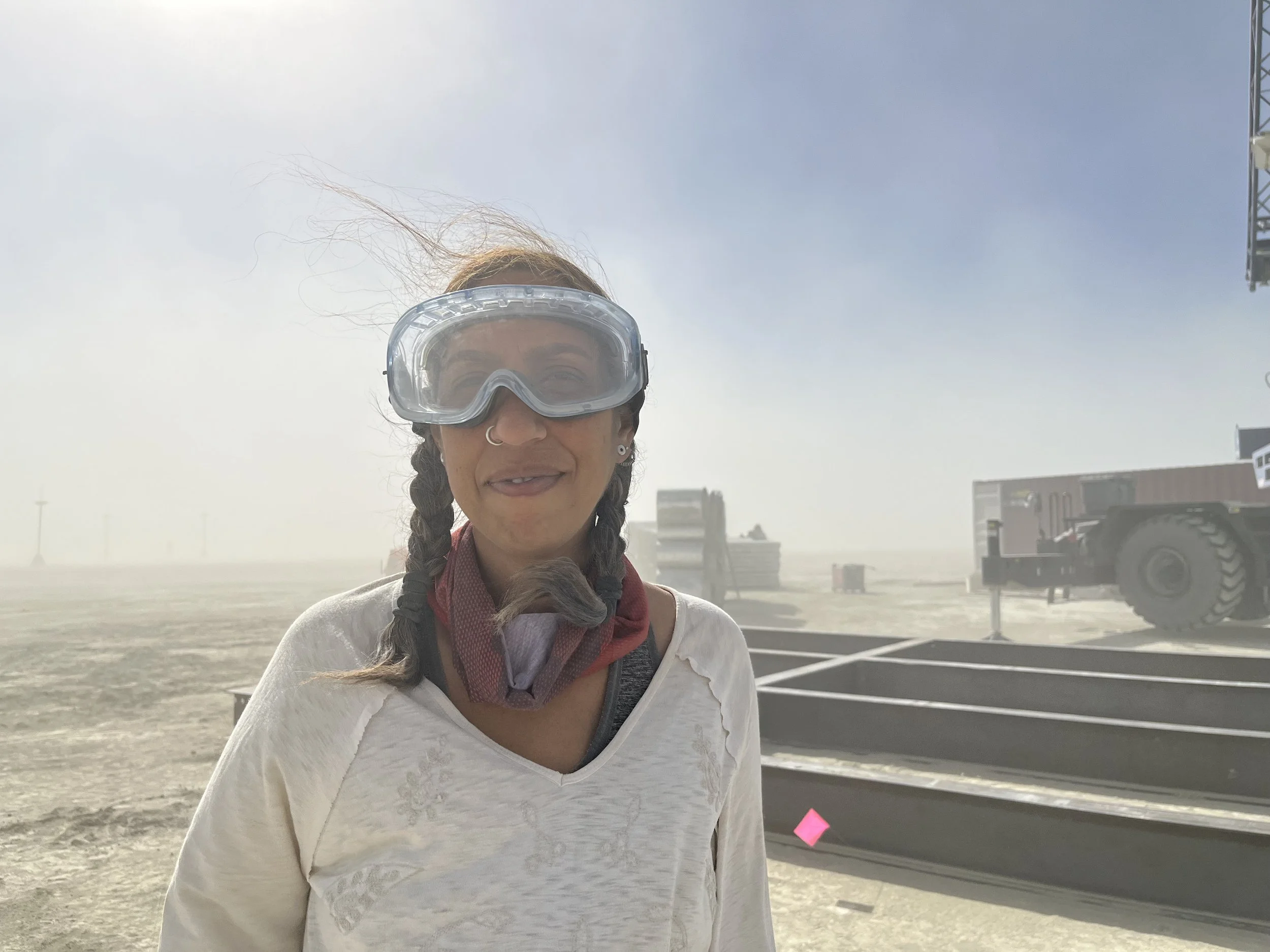
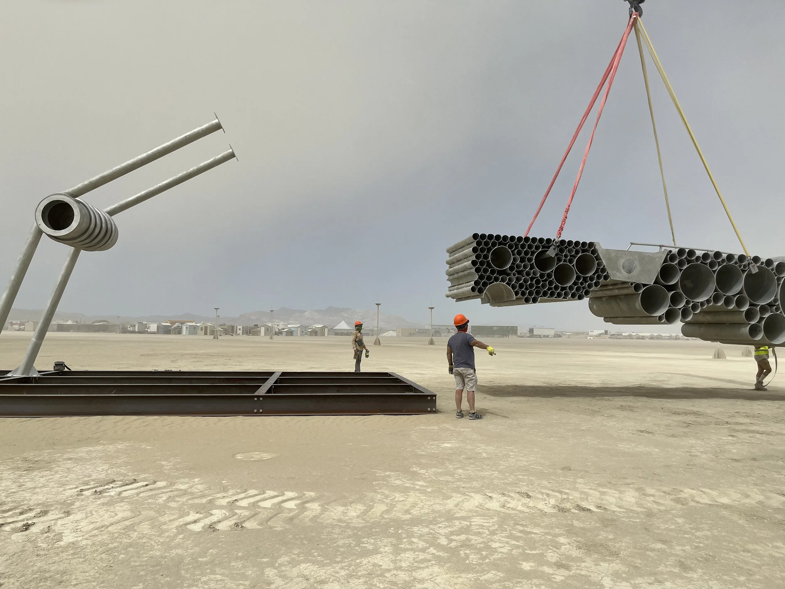
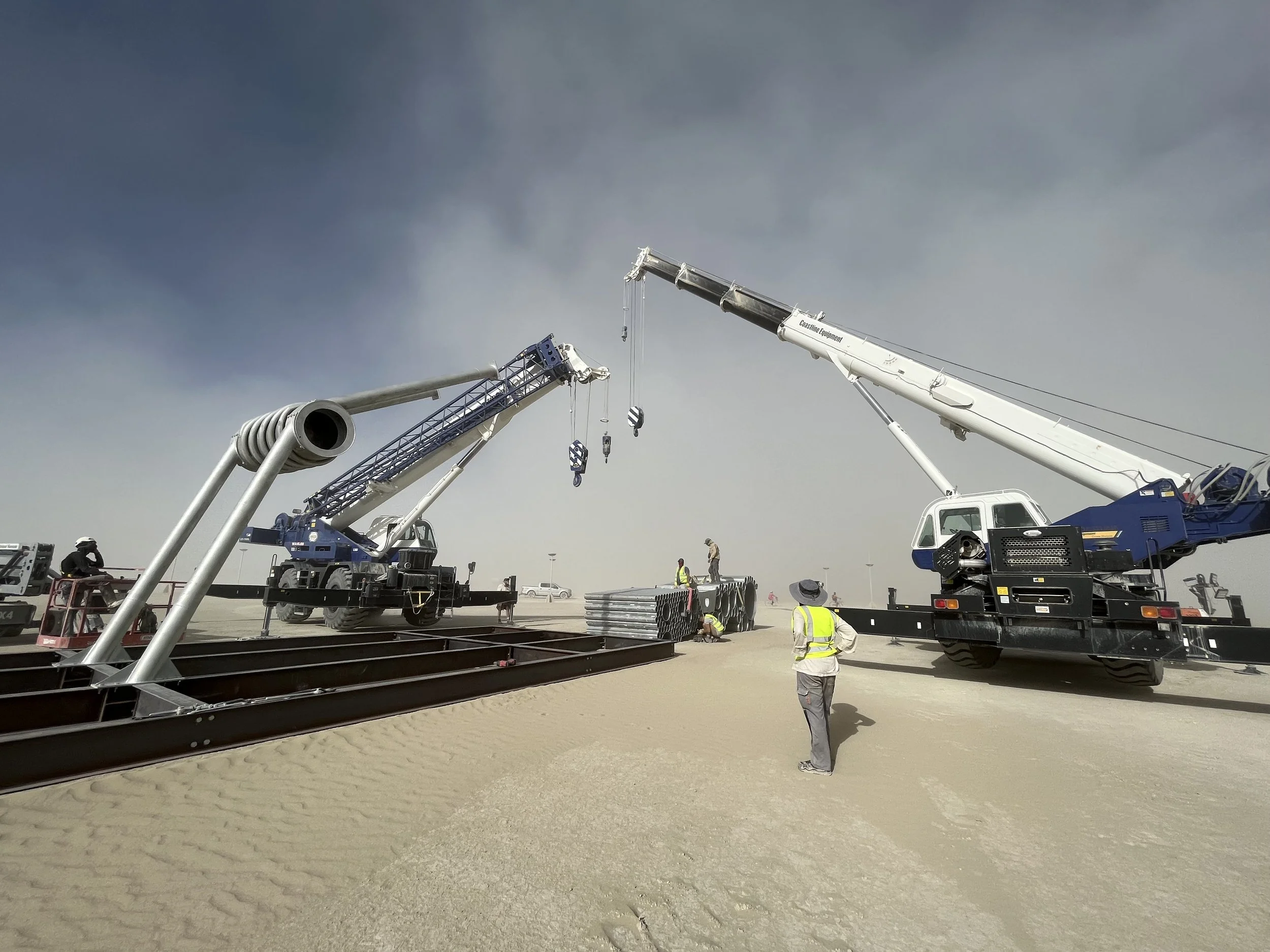
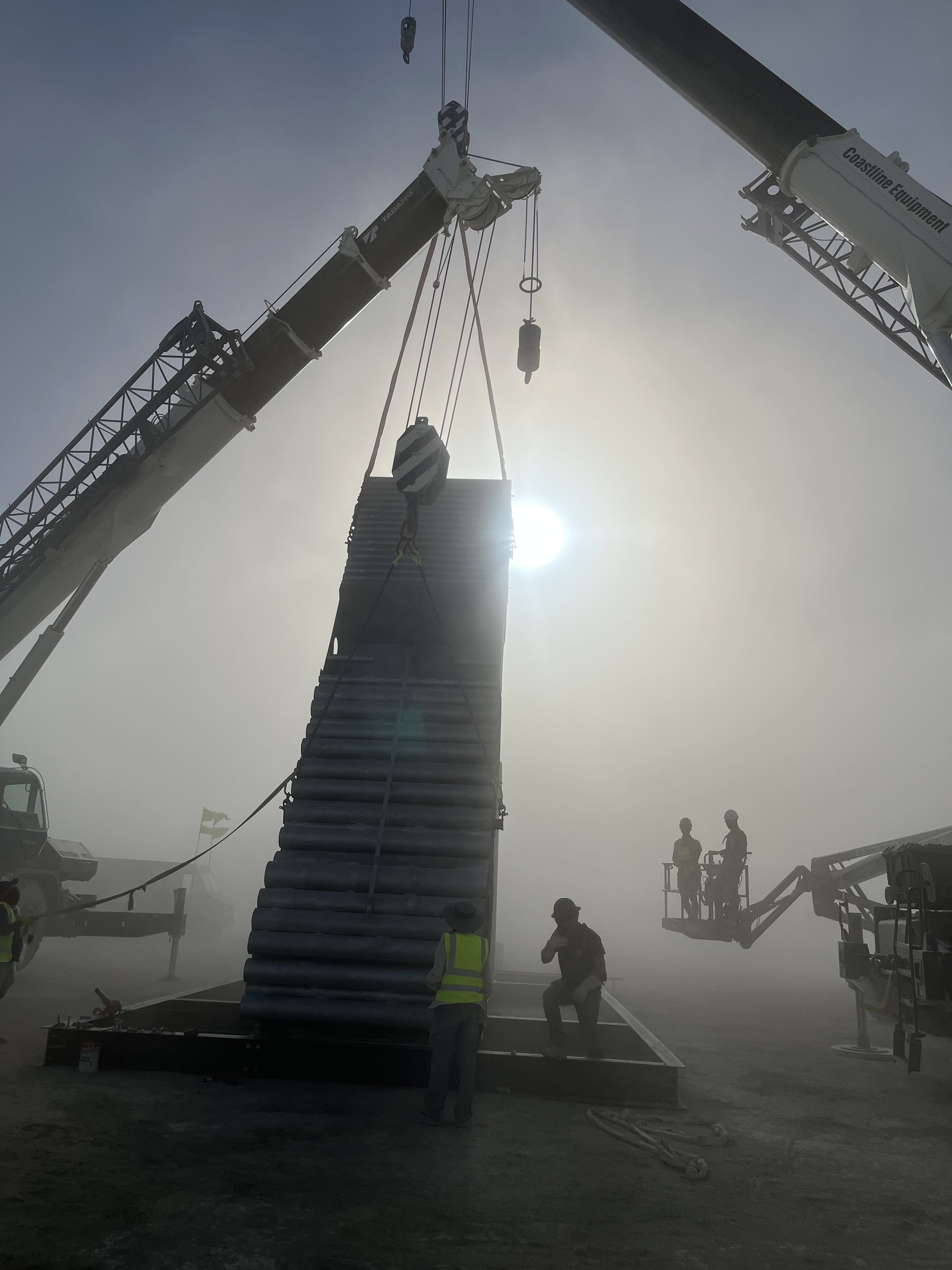
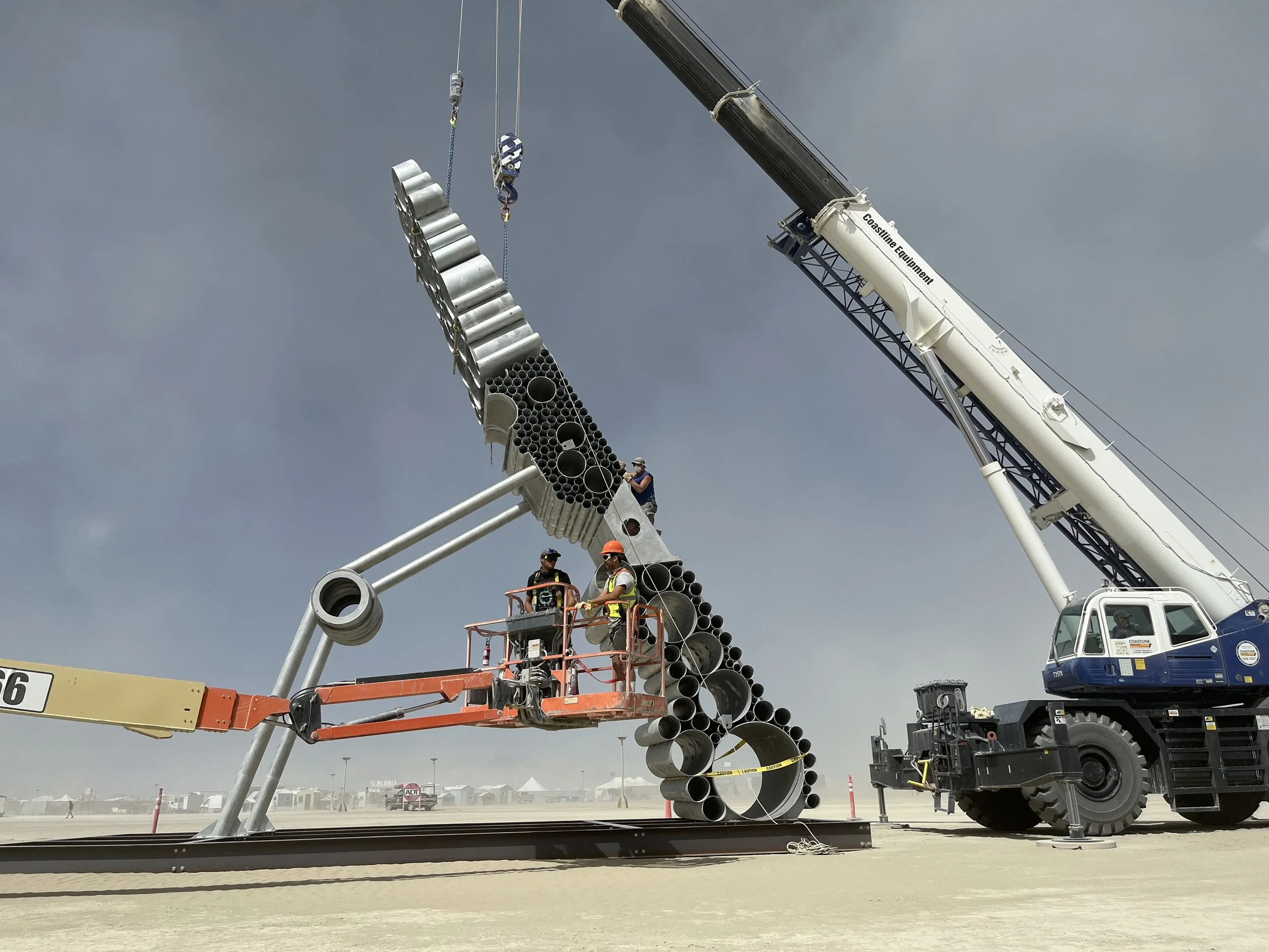
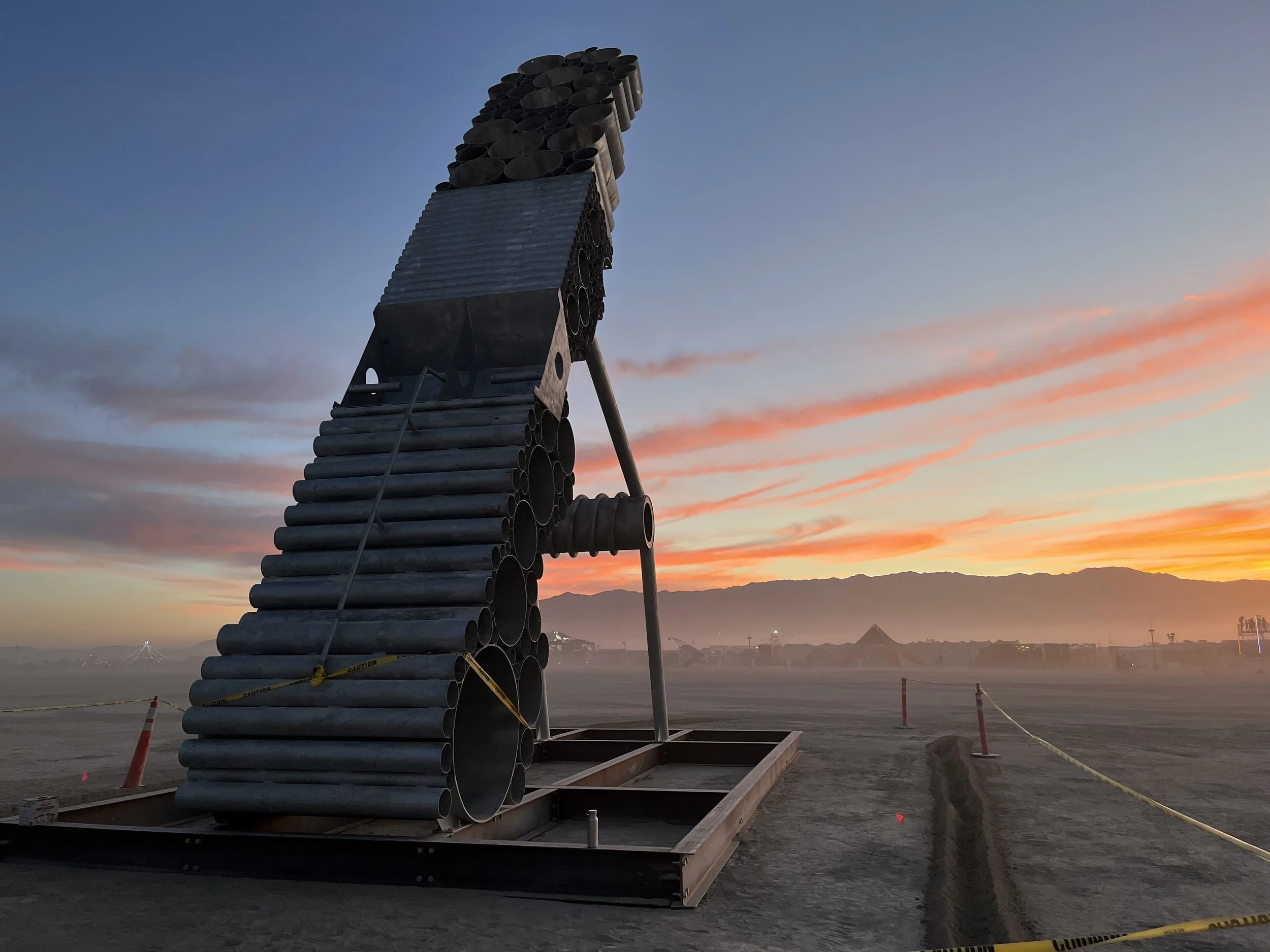
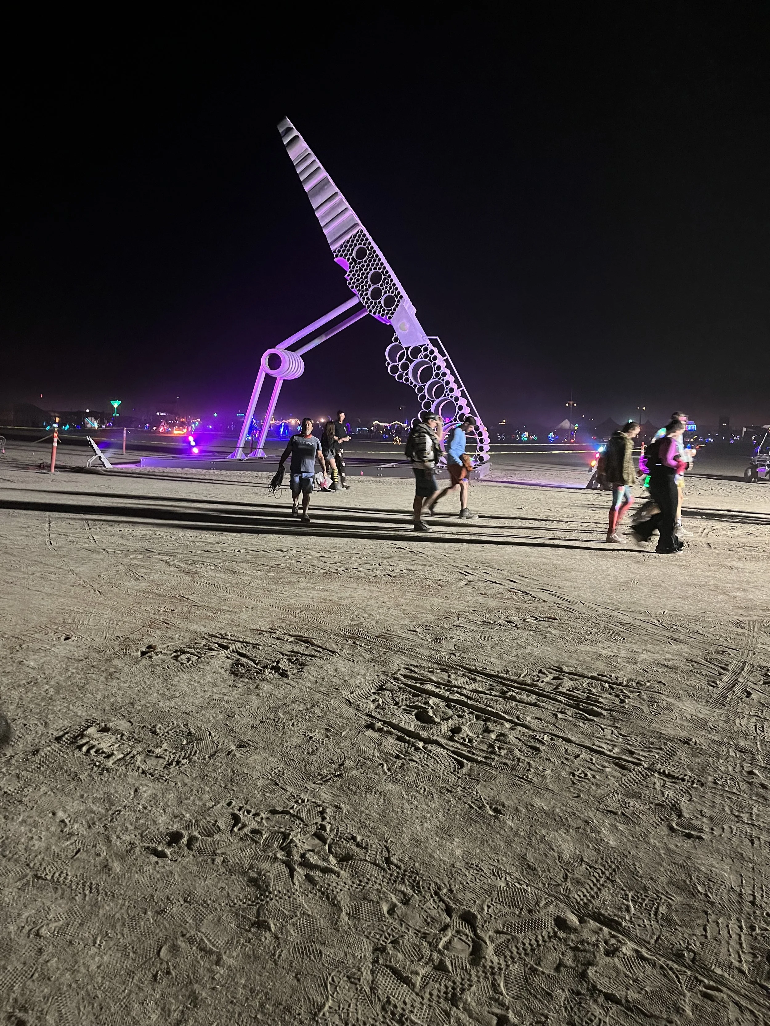
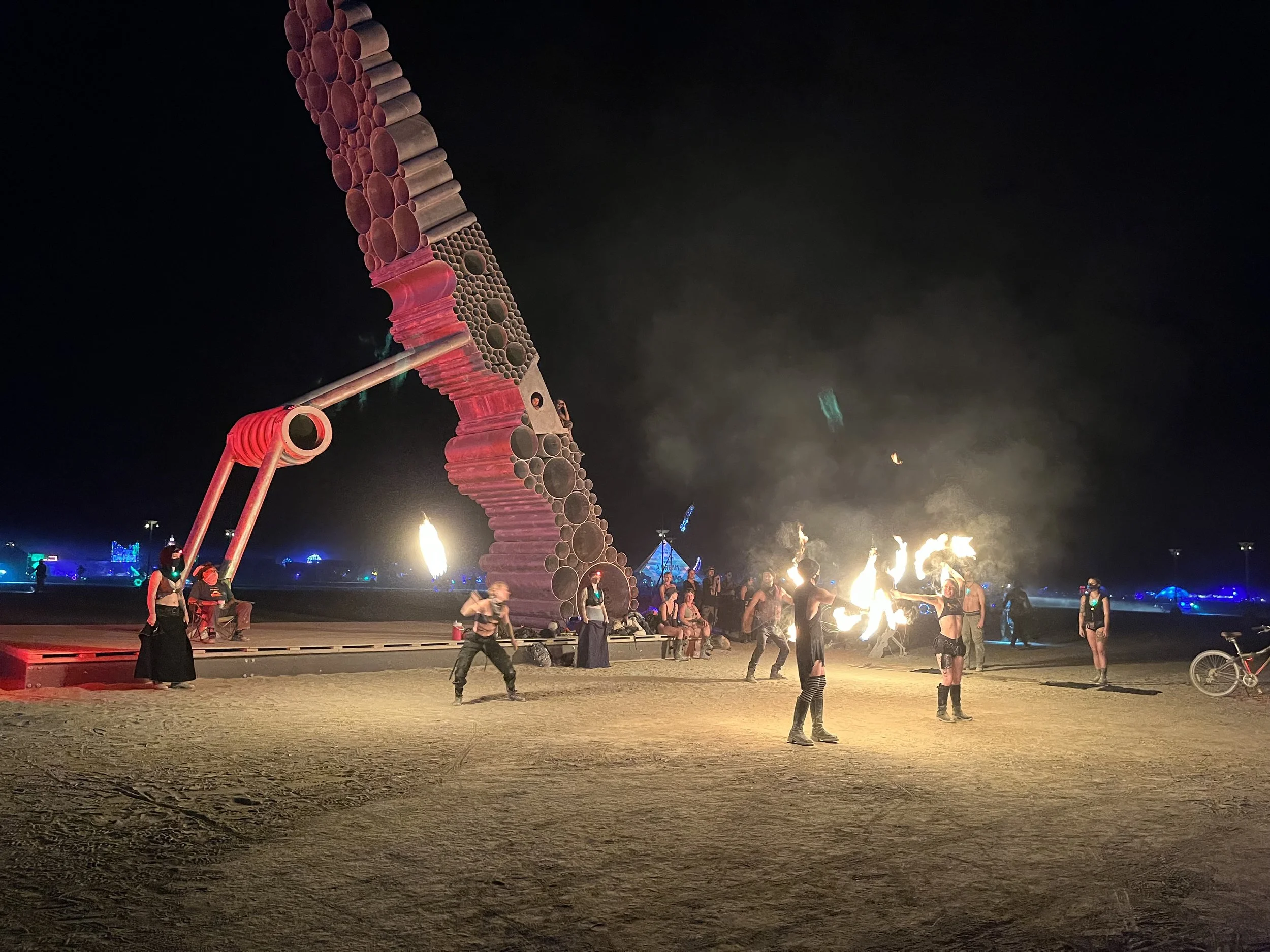
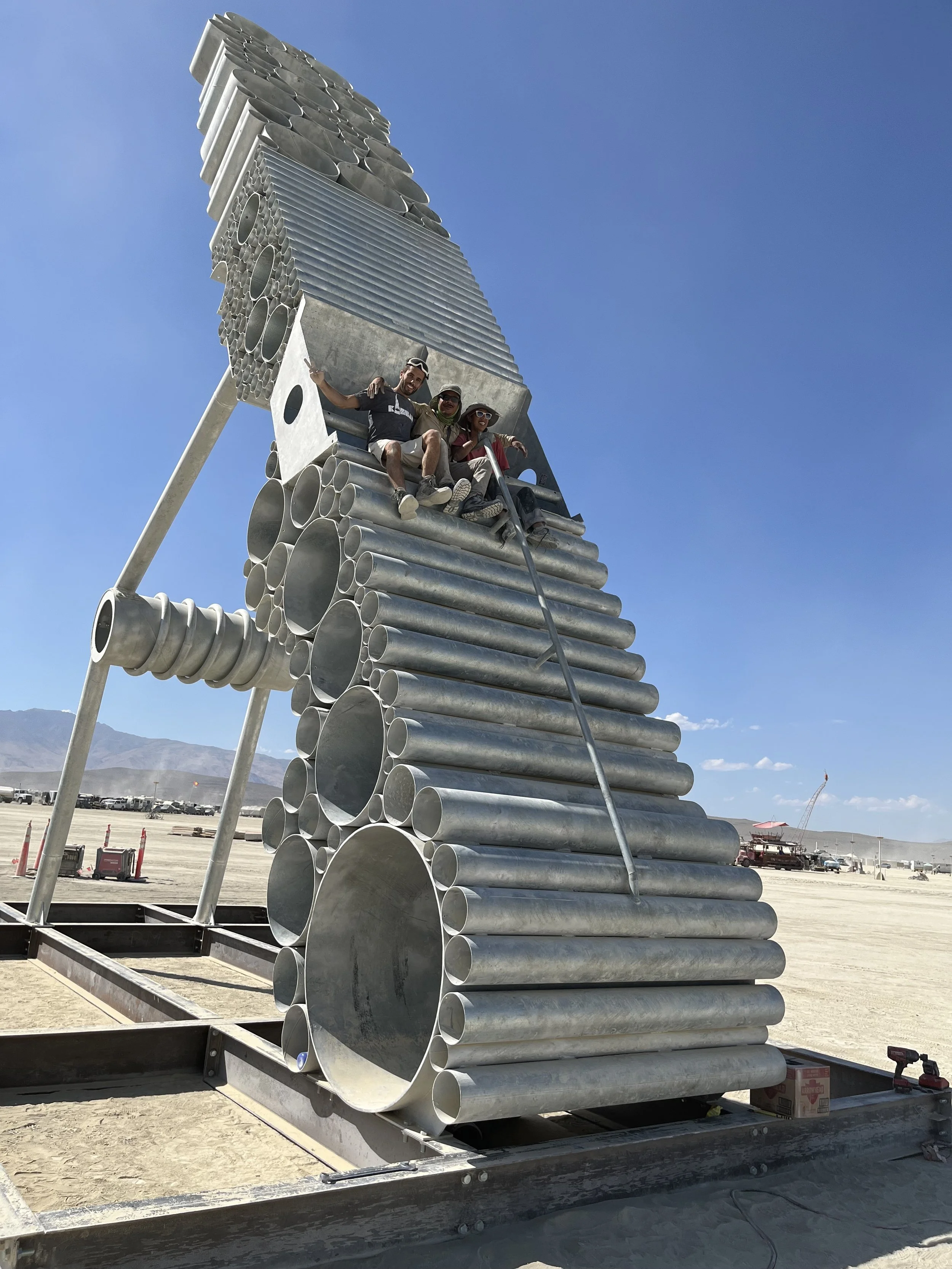
2022 - The Ressurection of the Clothes Peg, Burning Man, Nevada, USA
The Resurrection of the Clothes Peg was shown at Burning Man, Nevada, 2022. Fabricated in Lagos through the support of Dorman Long Engineers, the overall project was produced through Project Aikido and the Sao Foundation. This ambitious project spanned almost 3 years and involved multi layered partnerships, collaborations and expertise on a global level.
The artwork measures 13 x 12 x 2,5 m and is a sculpture of half a wooden peg, made from galvanised steel pipes stacked upon each other. The monumental form of an ordinary household item is meant to evoke a sense of criticality, questioning why such a rudimentary form is given such importance. The Resurrection of the Clothes Peg stands as a metaphor for the rise of the female voice and an expression of the desire to be heard by the marginalized. The work investigates how male superiority is upheld and how this affects female identity. The artwork emphasizes the unnoticed. The dichotomy of male and femaleness is expressed through this phallic form messaging feminine strength.
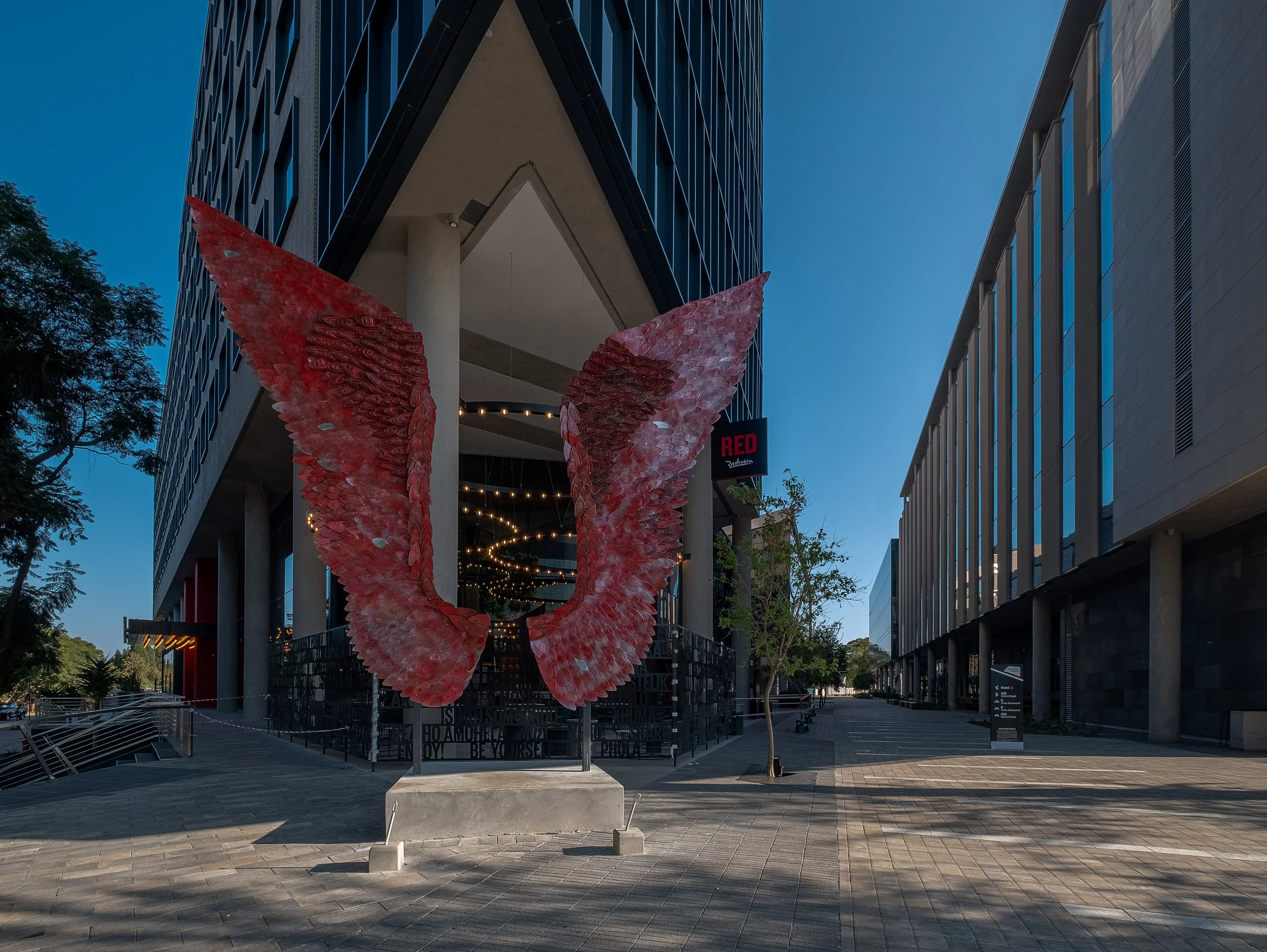
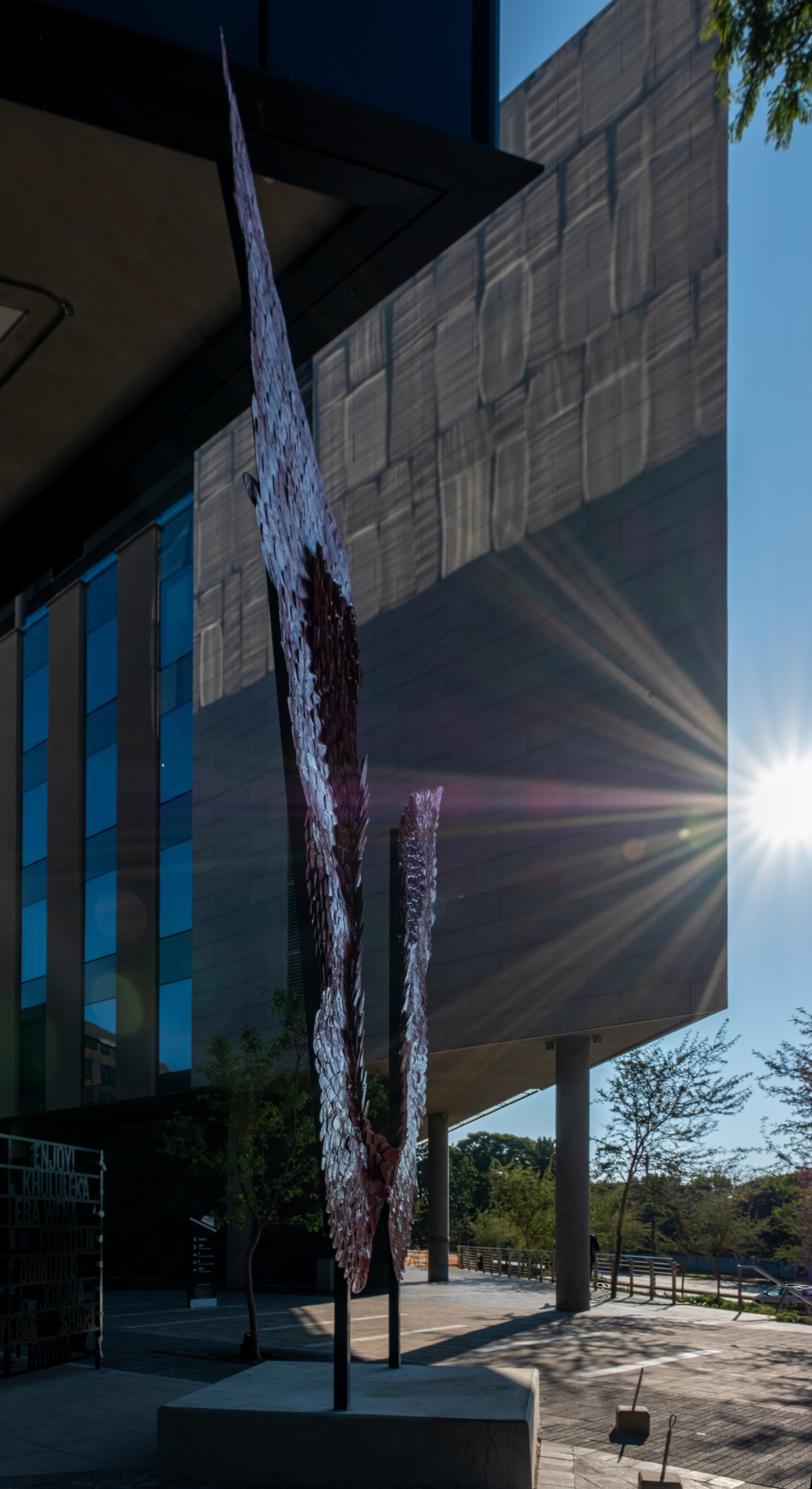
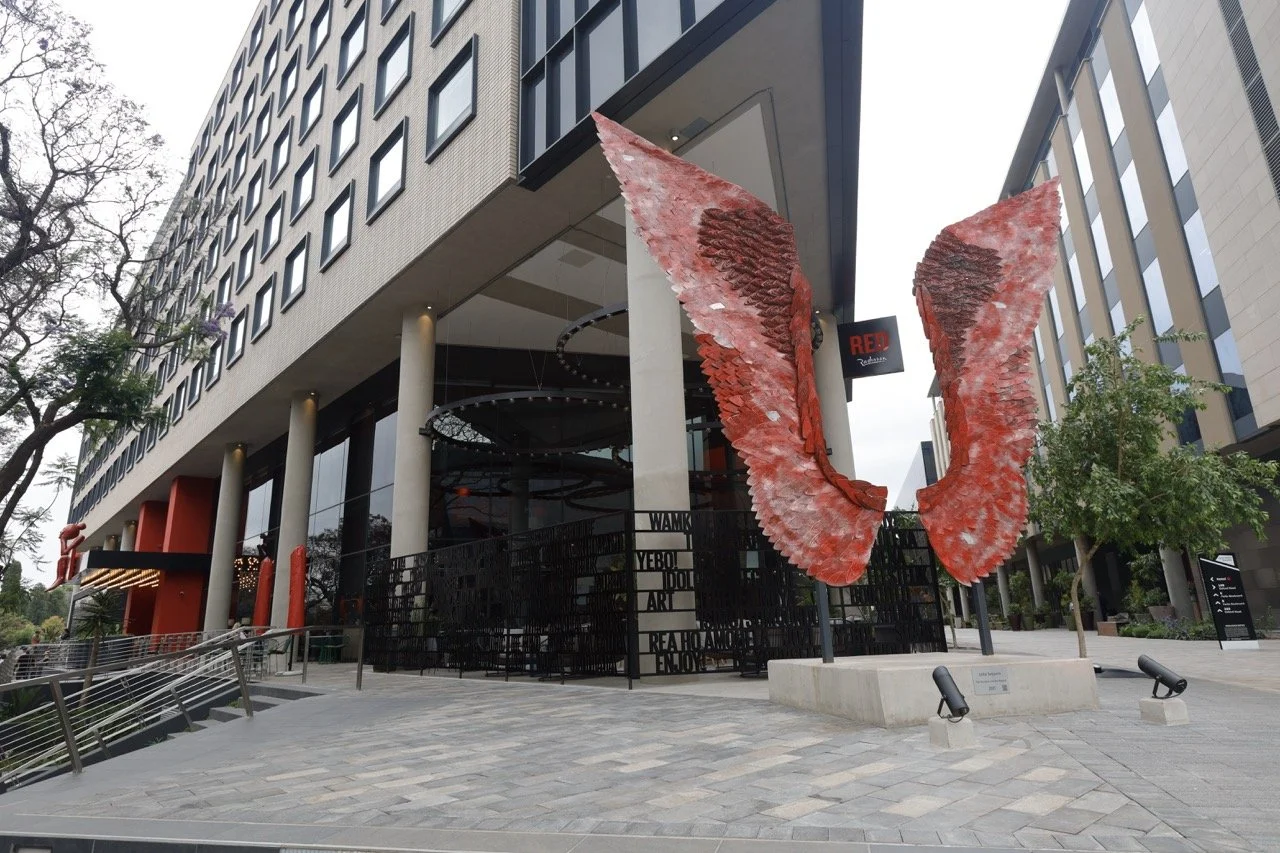
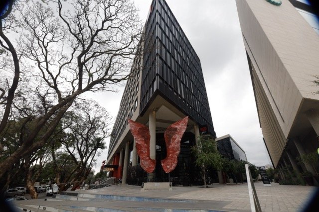
2021 - The Mundane and the Magical, Radisson Red Hotel, Rosebank, SA
A public art commission for the Radisson Red Hotel in Rosebank Johannesburg, this artwork is made from the sole-plates of domestic irons normally used to straighten clothes. The artwork presents contradictory ideas of angel-like wings and the ordinariness of domestic labour. It brings together notions of home and away at the same time. Flight and groundedness, promise and assurance, freedom and limitation, the ordinary and the imaginary, the Mundane and the Magical. The physical position of the artwork overlooks the inner city of Johannesburg which was built, occupied and developed through migrant labour. The artwork searches for the seemingly absent female voice within this history and simultaneously emphasizes the monumentality of that voice through the sheer scale of the artwork.
The artwork encourages audience engagement and while its interactive nature can be playful, it has contextual relevance that makes a significant statement. The gaze is thus shifted from looking at the artwork to being part of the artwork. Documenting oneself with the artwork ties into contemporary commentary on self portraiture. The artwork has become a landmark piece in Johannesburg.
There is a feeling of confidence and empowerment for the person interacting with the artwork. The artwork is enacted, and for a brief moment, the active participant becomes the artwork.
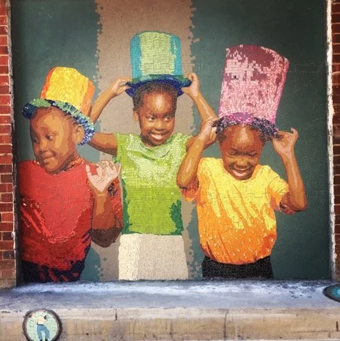
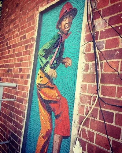
2018 - Mosaic, Sibikwa Art Center, Ekurhuleni, SA
Mosaics were made as permanent public artworks at the Sibikwa Art Center in Benoni, Ekurhuleni. Portraits were sourced from Sibikwa’s extensive archive towards portraying the organisations prolific contribution to performance art.
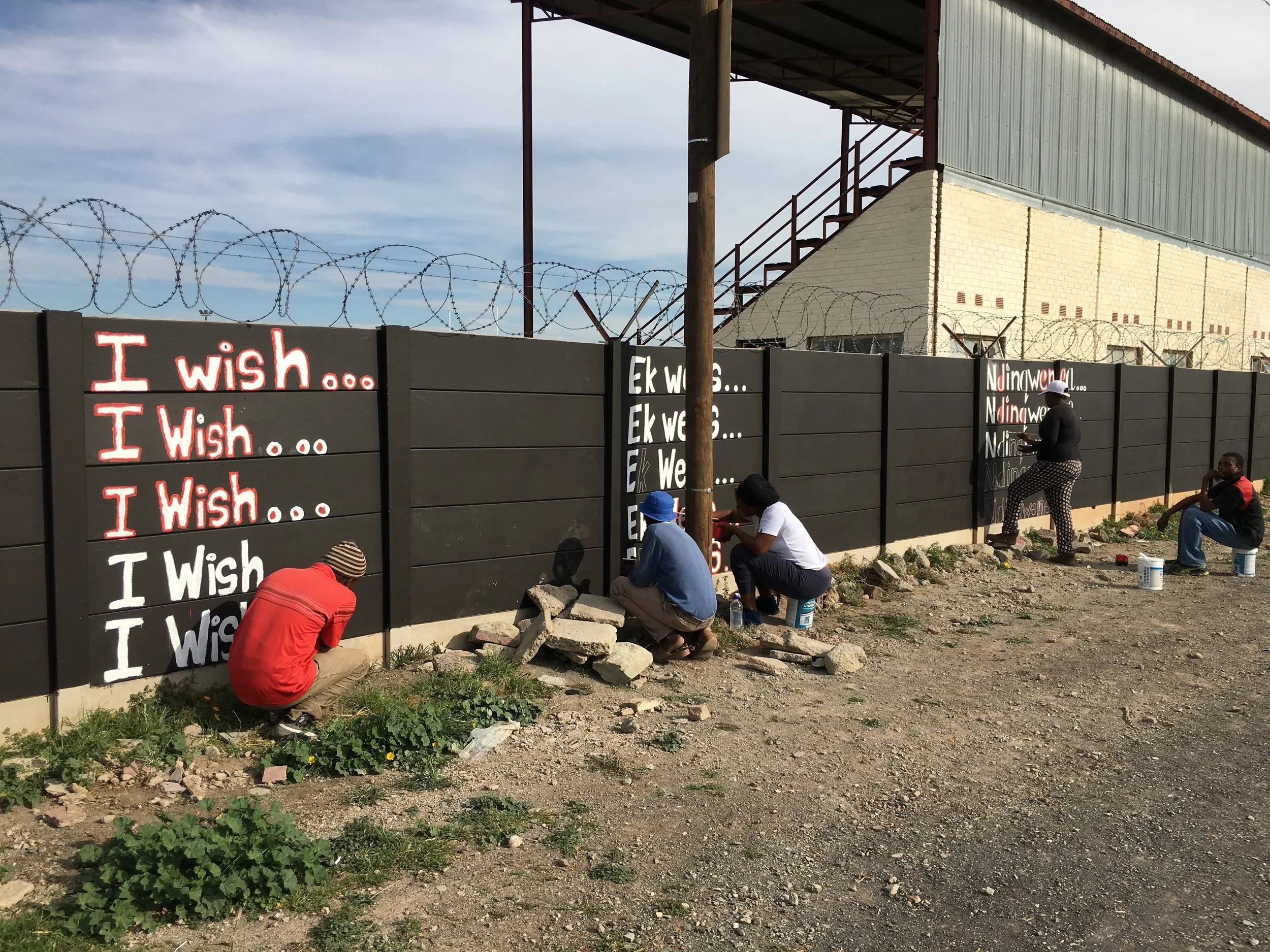
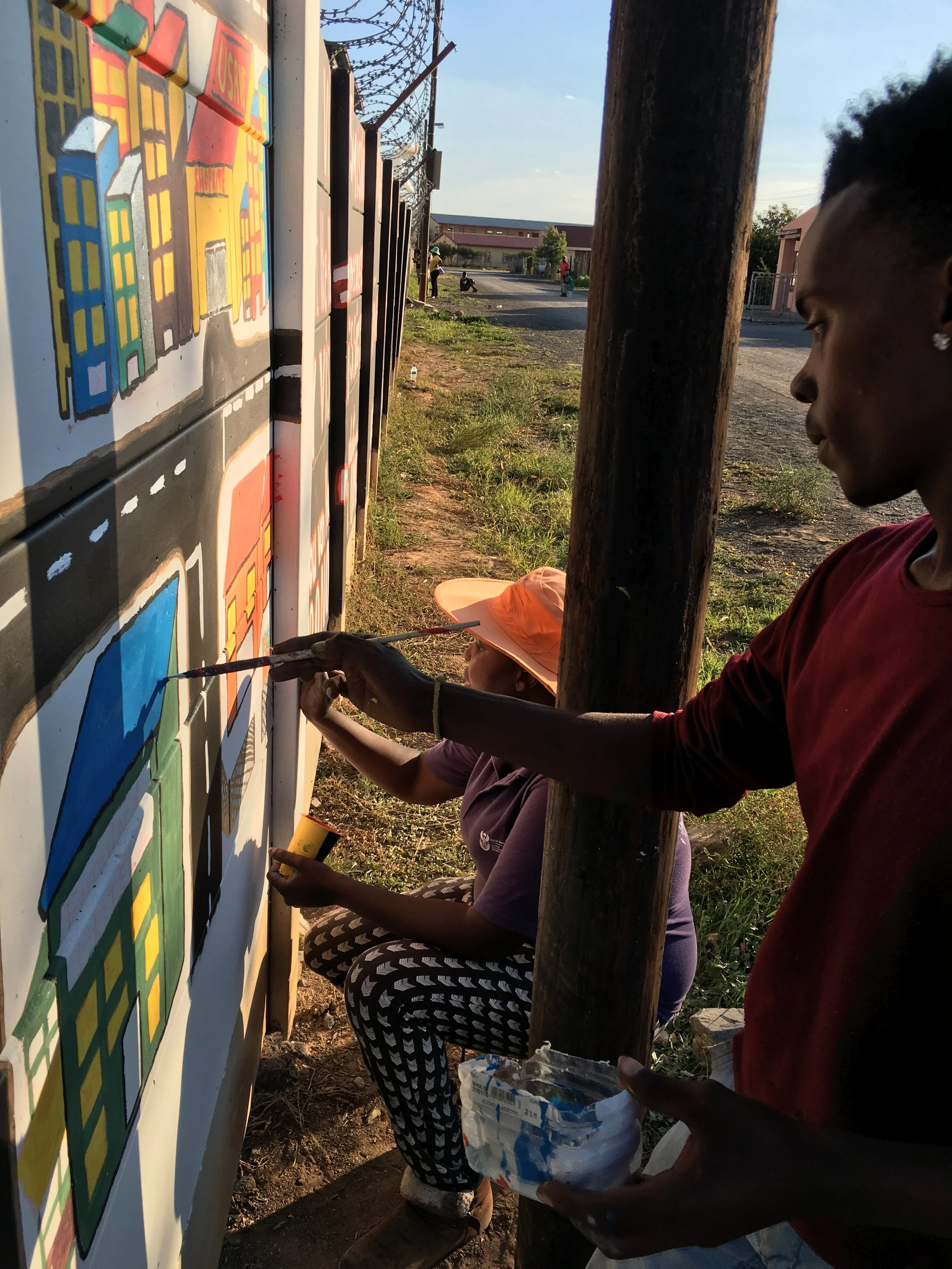
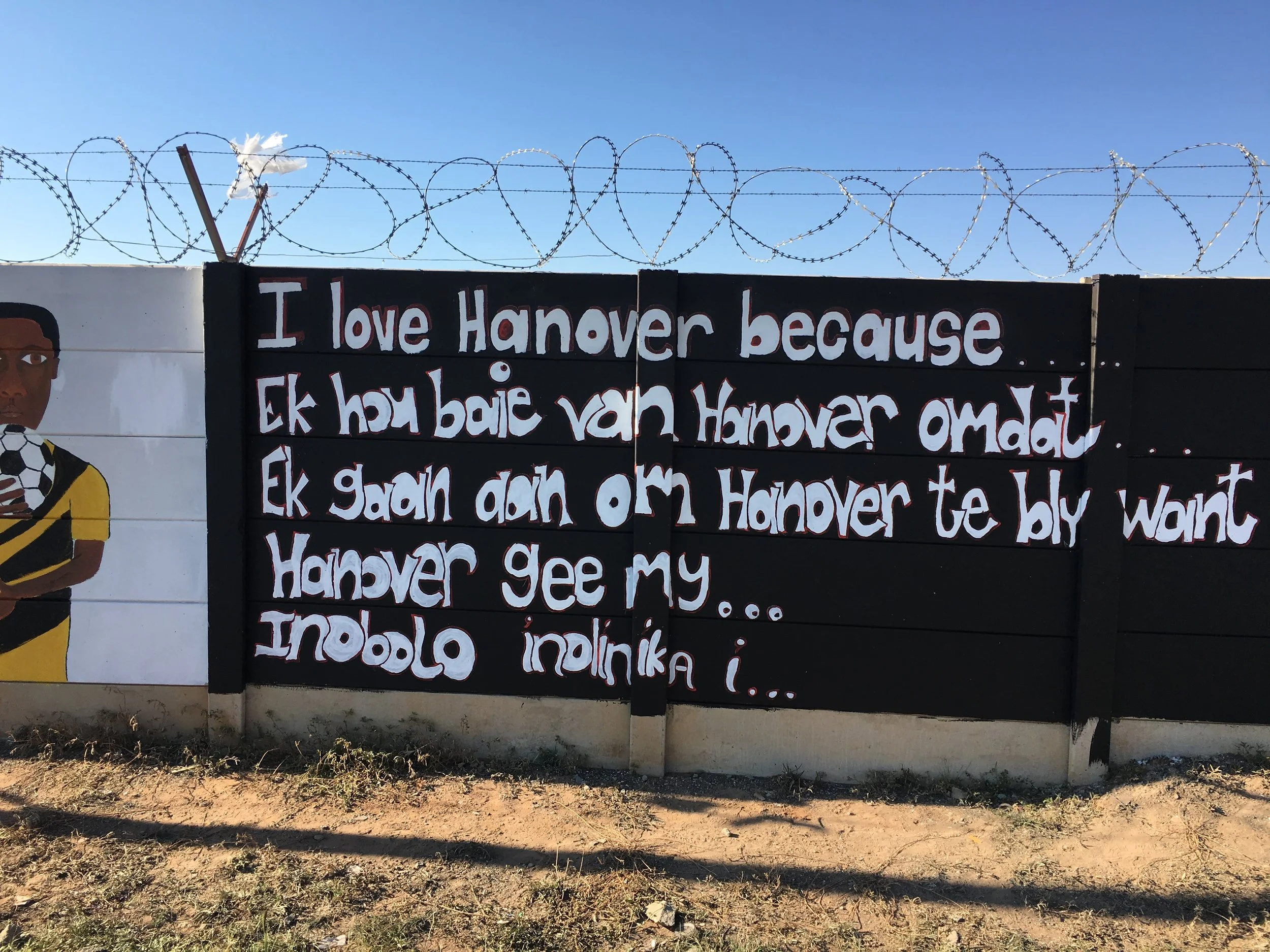
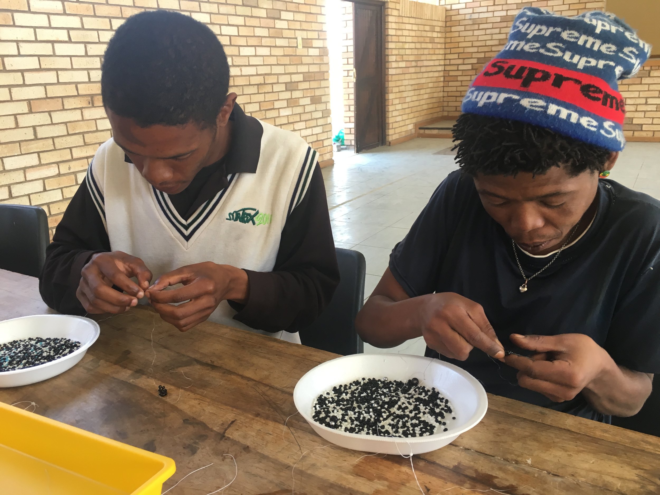
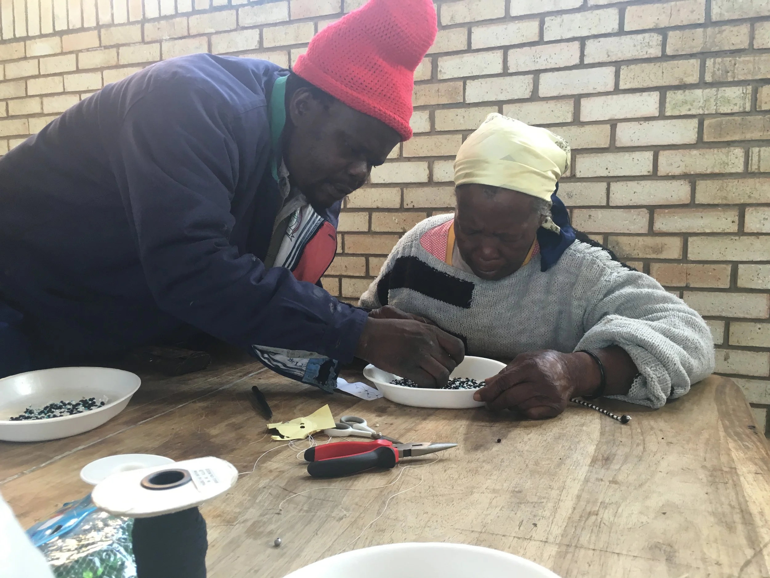
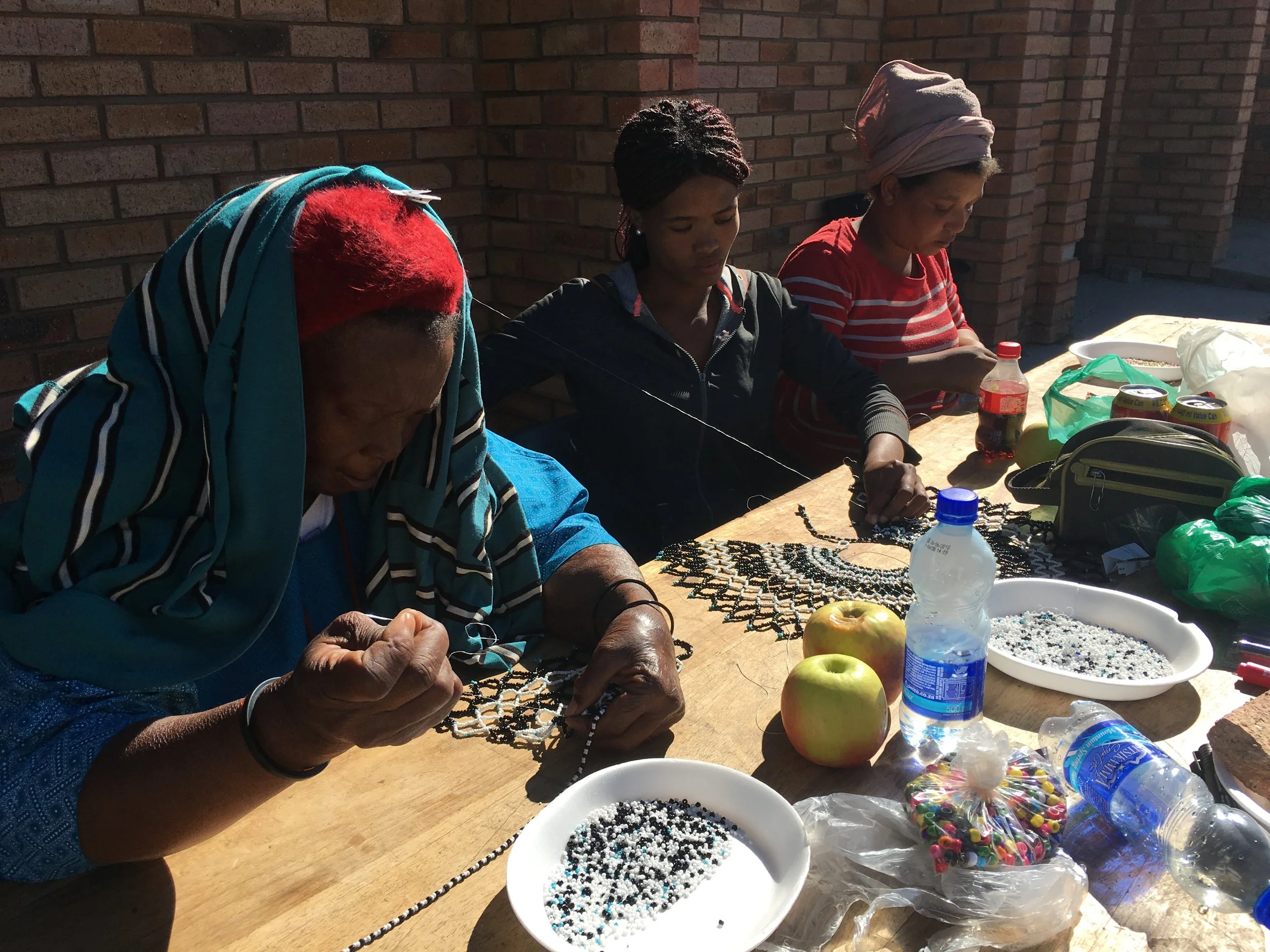
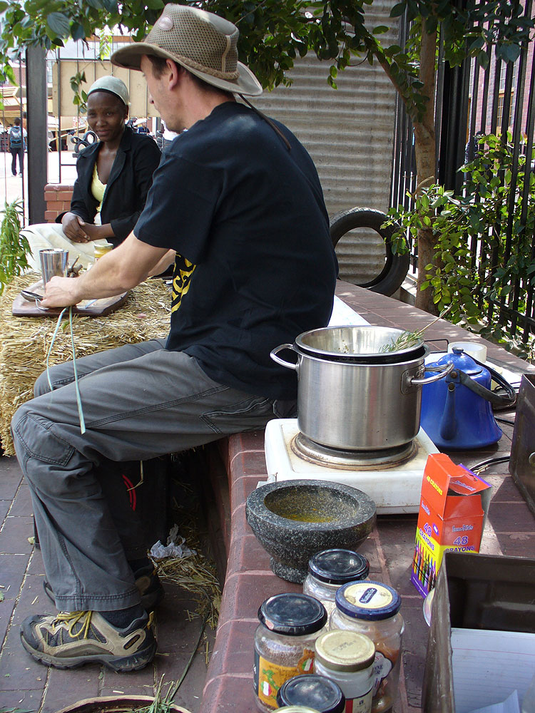
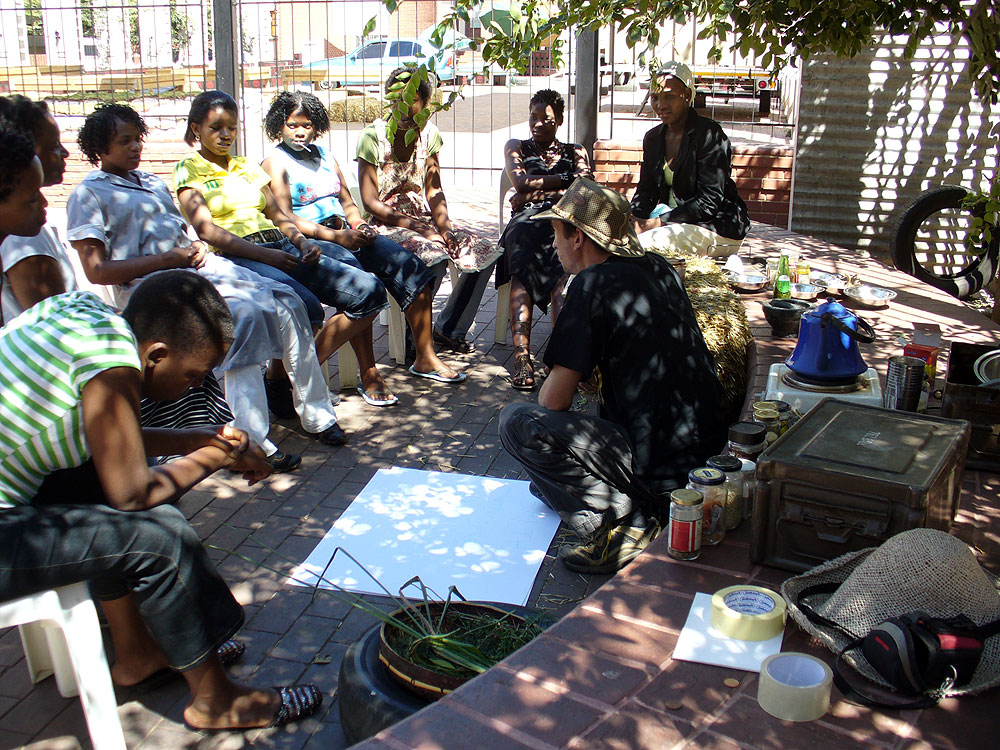
2016 - 2018 - Social practice, Eastern Cape, Northern Cape, SA
Based on the experience of working at grass roots levels through various contexts and over several years, I have developed an approach to social practice work that
is people-centered while maintaining artistic integrity. There is a fine balance between including people in the process and the outcome of an artwork that holds integrity. Thus, processes are inclusive and participatory without compromising artistic quality.
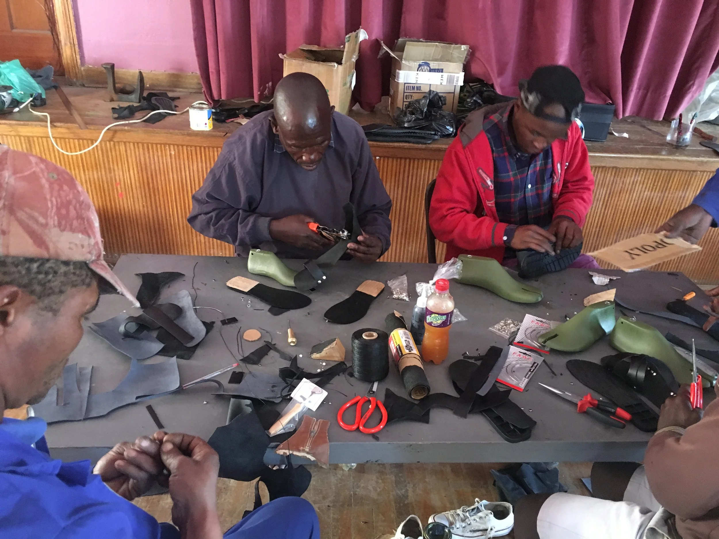
From 2015 to 2018, through Tshikulu Social Investment, I worked in the Eastern Cape, South Africa on projects driven by finding skills and knowledge within the communities to share with other community members. The approach purposefully focused on drawing out existing knowledge as opposed to coming in as an expert. This created huge trust in the community, built confidence and made for wonderful exchange of skills, which were supported by the project. This process was developed in criticism of similar projects with approaches that are often patronizing, filled with assumptions of lack of inherent skills in communities and masked as Corporate Social Investment.
Projects included shoe making, wire sculptures and sewing, and beading, in various communities in the Eastern and Northern Cape, South Africa. These were taught by artisans from the community. Interactive chalk board murals were made to gauge community response to their relationship with their hometown. Participants were unemployed youth.
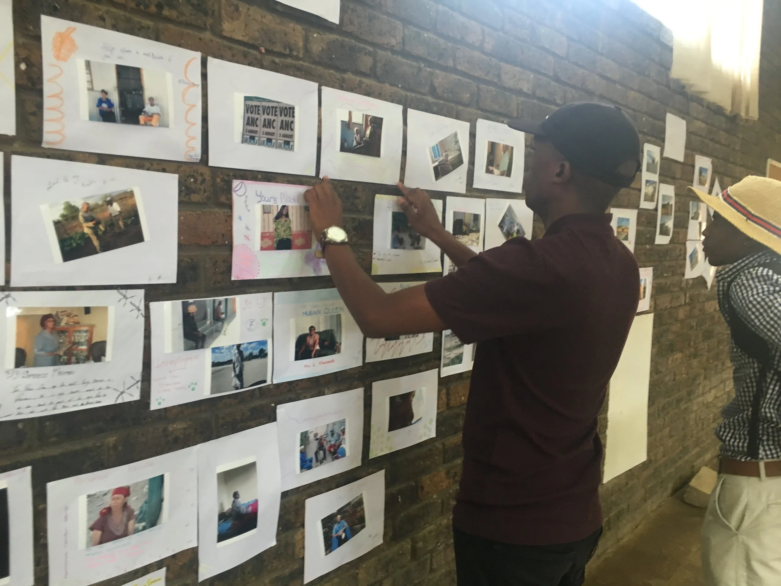
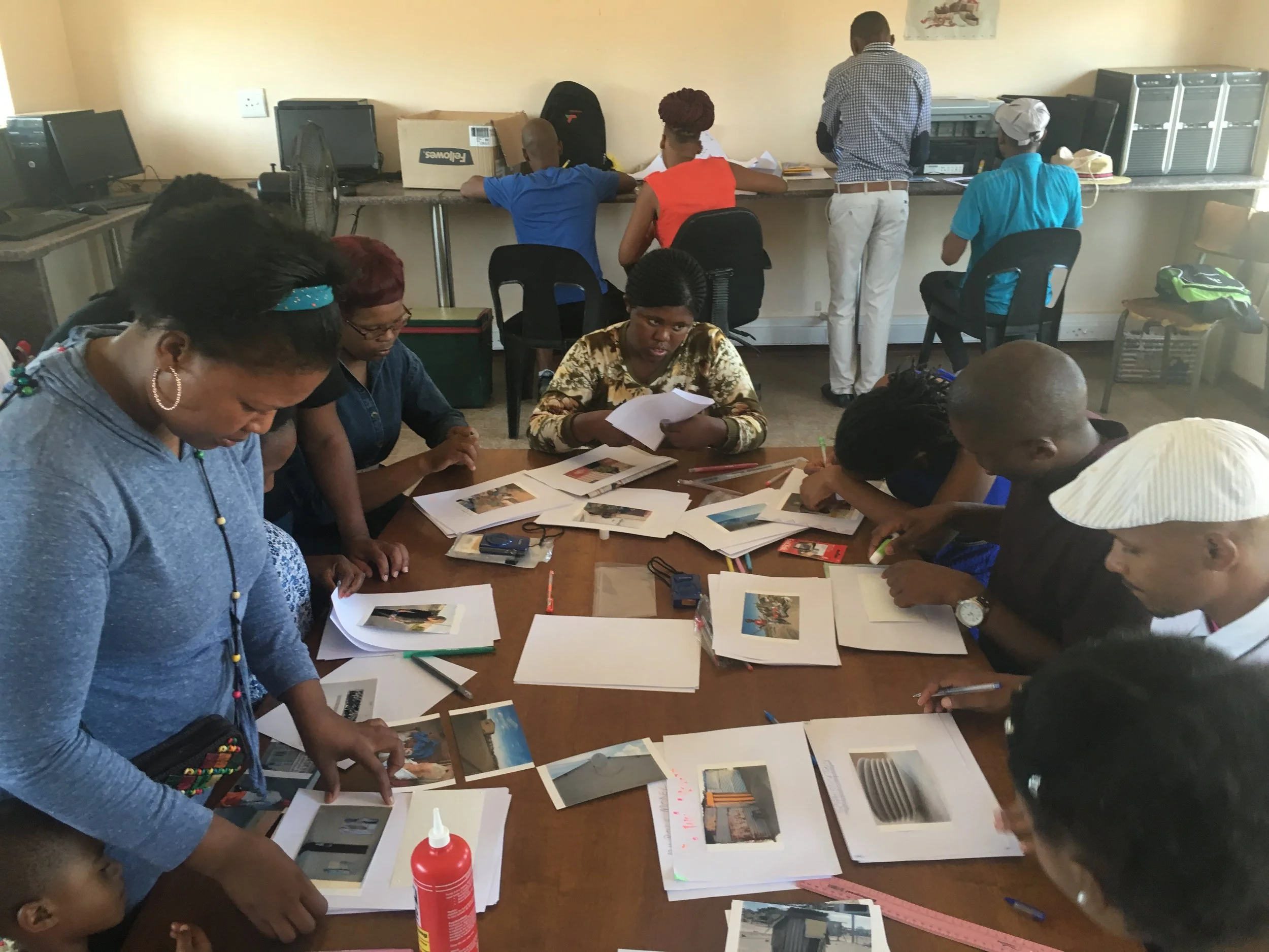
There is huge significance in creating methodologies with high expectations and standards. Challenges were embraced and participants come forth with innovative solutions. As a qualitative research method, a Photo Voice approach was used as a tool for identifying social challenges within a community. The participant-taken photographs then direct leadership opportunities within those contexts.
In-built key practices include the creation of safe spaces, consent, mutual respect, as well as the opportunity to be critical. Processes are designed to be inclusive, engaging and stimulating.
2015 - Light installation (as embelishment during the festive season) for the Embassy of Switzerland, Pretoria, SA
This "Swiss light art installation with a hint of South African-ness" was a response to participate in the annual festive atmosphere of the street in Pretoria, where residents and other Embassy homes in the vicinity install Christmas themed lighting and decorations. However, instead of a typical Christmas decoration, a light installation was developed that has a distinct Swiss theme with a twist - a specific yet subtle inclusion of a South African context. Inspiration was drawn from the "Alpaufzug", a spectacular traditional migration of cows through the Alps. The cow procession is a significant event in the Swiss culture as over 350 cows are lead through the mountains over a 70-day period. Traditional Swiss art making reference the Alpaufzug through paper cut-out, symmetrical imagery. Drawing on this tradition these conventional forms of iconic Swiss representation was used to create light boxes that fit into the existing architecture of the Swiss Embassy home in Pretoria. The inclusion of South African and specifically Pretoria fauna and flora into this typical form of Swiss representation invite the viewer to carefully examine the artworks and almost "discover" the anomalies. A row of Swiss cows may be accompanied by a Nguni cow and a Jacaranda may find itself among a forest of Swiss pines.
Despite the light-hearted rendition of the work, one becomes acutely aware of the conceptual underpinnings of imagery that depict migration and its engagement in contemporary discourse. The literal search for and move to greener pastures is a global phenomenon that is not only evident with Syrian refugees, but visible in our own country. The very notion of "home" is a lucid one, where patterns of movement are evident throughout human history.
2014 - Pebble Mosaic, Prince Albert, Eastern Cape, SA
Two weeks were spent in Prince Albert in the Western Cape to create this large pebble mosaic for the Prince Albert Art Festival. A specific site was identified that both connects and separates two distinct communities within the area, around which the concept and design of the project was developed. All the materials and labour for the project were locally sourced and a series of conversations with varied groups and individuals in the town quickly followed.
A synchronistic recurrence of the tortoise as a theme led to the design and the actual production of the artwork included teams of people working on different parts of the project. While not everyone worked on all of the days, a team comprised of just under 80 people used three truck loads of sand, stones too numerous to count and 30 bags of cement to create this 56 square meters mosaic. The design included a tortoise shell on the one side of an existing pathway, with the edges of the tortoise mimicking the profile of mountains surrounding Prince Albert. The inside of the tortoise references the township, known informally as die Lap ("the cloth"). A few conversations suggested that the name is derived from a quilt (lappies kombers), which refers to an image of the place covered in flowers pre-development. Some have even referred to the entire place of Prince Albert as Die Lap. On the other side of the pathway the mosaic illustrates a huge flower (Botterblom) and the leaf of an aloe, known locally as a Kan-nie-dood ("can not die"). All these elements (tortoise and plants) are specific to the area.
The message conveyed through the work is that although life in Prince Albert may seem idyllic (as a holiday destination, tourist attraction and place to retire for many), the reality that confronts many speaks of a real need for survival and a resilience, as illustrated by the depicted tortoise (Bergskilpad) that eats the Botterblom and through the Kan-nie-dood. There are significant social challenges in this town, including high levels of excessive alcohol abuse and related alcohol fetal syndrome. A small element in the design alludes to an observation specific to the site of the mosaic. From very early in the morning and throughout the day, people walk up this tiny hill towards the bottle store with empty crates and return with full crates of beer and several boxes of wine. This phenomenon continues throughout the weekend. A few small tortoises, known as pad lopers ("path walkers"), placed adjacent to the desire line, illustrates this observation. Some of these pad lopers have a black square stone on their back, referencing a crate of beer; a heavy burden.
2013 - Beaded portrait for the funeral of former president Nelson Mandela
It was a great honour to create the official portrait for Nelson Mandela’s funeral in Qunu in December 2013. The work is made from stringed seeds, it spans two meters squared and was featured on global media.
Above: Beaded portrait of Madiba in progress. Right: Nelson Mandela beaded portrait (2013), Stringed beads, 2000 x 2000 mm.
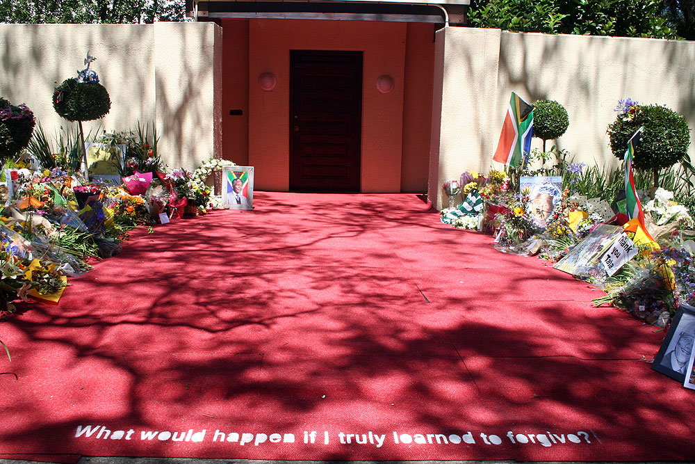
2013 - Forgiveness, Johannesburg, SA
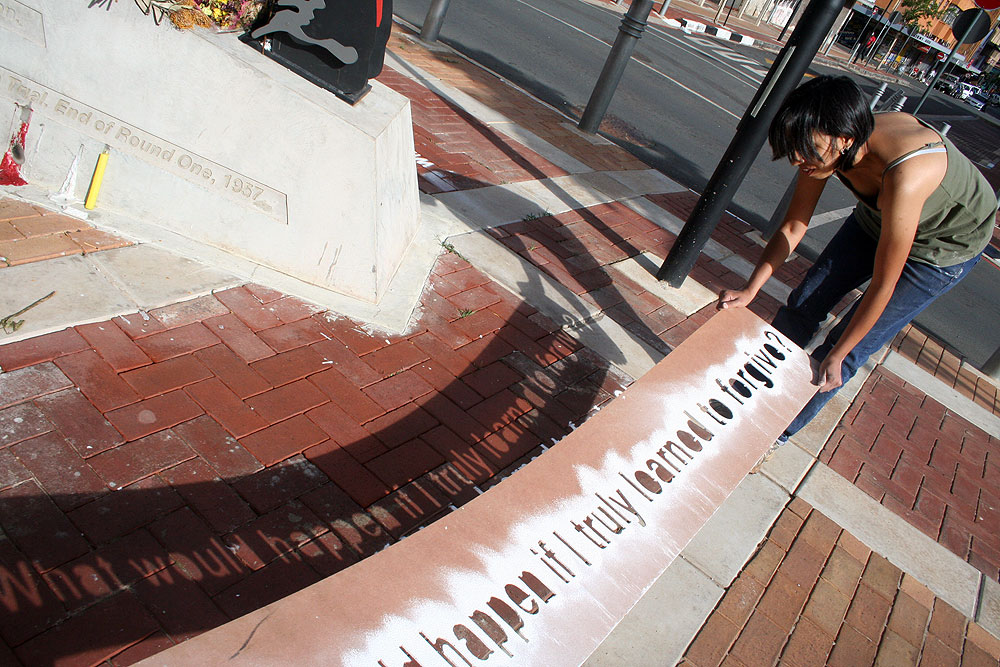
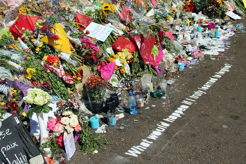
The decision to create a public artwork on forgiveness on Monday the 16th December 2013 was made prior to Madiba’s passing. The continuous messages of reconciliation and forgiveness re-iterated immediately after his passing reaffirmed the need for this temporary public art intervention for me. Early on Monday the 16th December 2013, Seejarim sifted lime powder through a stencil to create a text based artwork around the Magistrates Court in Johannesburg as well as outside Nelson Mandela’s house in Houghton.
The public artwork is in honour of Reconciliation Day and speaks to our specific history and about our need to forgive – both as a nation and as individuals. According to recent research, South Africa as a nation rates amongst the lowest on the happiness index, and I believe that it is largely due to our inability to forgive. Crime and other injustices on various levels are perpetuated by our personal resentments and as a South African contemporary artist, I would like the opportunity to make these concerns visible through a temporary and relevant public art intervention.
The artwork is posed as a question which forces us as viewers of the artwork to question our own personal positions of grudges and inability to forgive and thus alludes to the repercussions thereof. The text spells out the following words: “What would happen if I truly learned to forgive?”
The text is made from lime powder, obtained from Robben Island on another project in 2009. The artwork was temporary with the text lasting for a few days.
As a nation South Africa previously observed this day as the Day of the Vow, commemorating the 470 Voortrekker victory over the 10 000 Zulu army in the Battle of the Blood River in 1838. Later we acknowledged this day in 1961 with the formation of Umkhonto we Sizwe. Now in post-apartheid South Africa, we celebrate this as the Day of Reconciliation and this artwork reminds us of the significance thereof and how we as individuals can contribute to real healing of our community.
2008 - Figures representing articles on the Freedom Charter, Kliptown, SA
Walter Sisulu Square, Kliptown, Soweto, Johannesburg
Commissioned by the JDA (Johannesburg Development Agency), Project Managed by Studio Mas Architects
Installed in November 2008
Each of the 10 sculptures represent one item on the Freedom Charter. The sculptures are made from layers of slate stone, with an inner structure of steel and concrete. The motivation for the use of stone references the name Kliptown ("klip" meaning "stone" in Afrikaans), as well as the process in which the Charter was adopted; where thousand of people gathered and wrote down their ideal vision on a piece of paper, which was then collated and reformed into the Freedom Charter. Each figure weighs between 600 kg and 1 ton.
Photo credit: Anthea Pokroy
2008 - Screens for the South African Chancery, Addis Ababa, Ethiopia.
The objective of this project was to create a sun-screen for the South African Chancery in Ethiopia. San paintings were used as subject matter to allude to Addis Ababa as a port of entry both by land and by sea. The screens are made of stainless steel mesh and approximately four-hundred-thousand pop rivets. The work was project managed by MMA Architects in March 2008. The separate screens measure: 34,2 x 9,1 m and 18,8 x 7,6 m.
Photo credit: Prof Jonathan Noble
2007-2010 - Why Men, created for the Sandton Business Improvement District, Johannesburg,
Why Men (2007-2010), Illuminated public sculptures that promotes interaction installed around Sandton, Johannesburg during the festive season (December). The site specific figures responded to their location by interacting with elements or observations of human behavior in that specific space. For example, fishermen were placed in a water fountain, or a figure on a laptop sat on a bench frequented by executives.
Project managed by Art Art Work (AAW!)
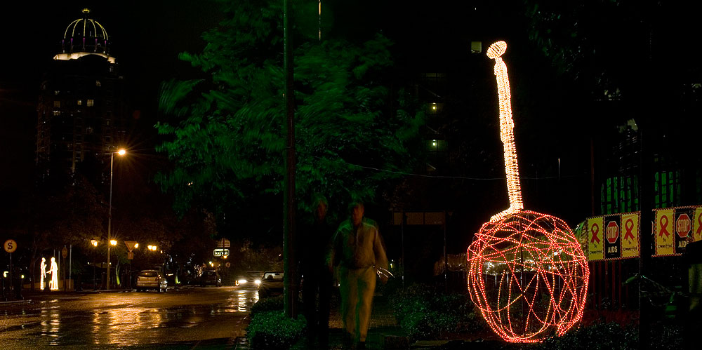
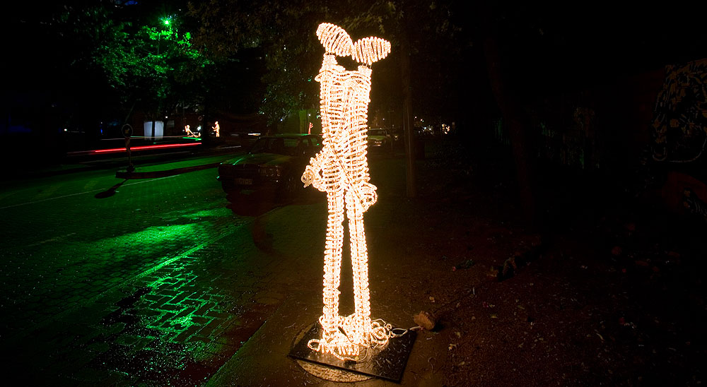
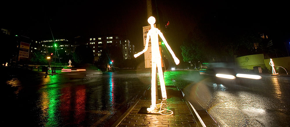
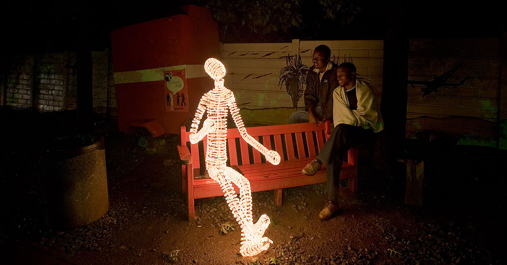
Photo credit: Dean Hutton
2007 - Cascoland, The Drill Hall, Johannesburg
An awareness of the lack of anything green in the inner city led to the creation of two very long (11 m each) grass benches that served the public audience during the various activities of the Cascoland Festival. With the help of the Social Services Department, a vegetable and herb garden containing herbs specifically useful in the treatment of HIV Aids, was also created adjacent to The Drill Hall as part of this project.
2007 - Mural commissioned by Eskom
This mural was created for Eskom at Megawatt Park in Woodmead, Johannesburg in 2008. The mural measures 9,98 x 2,4 meters and was made from 0.8 mm solid panel electric wire, glue and board. The thin electric wire act as “colour” to create a pliable mural to fit an existing curved wall at Eskom’s head office. The subject matter depicts modes of renewable energy.
Truth [detail] (2006), Three-legged pot as zoetrope, thaumatrope, wheel and concrete base. Installed in Jennings Street, Fordsburg, Johannesburg
2006 - Truth, Newtown, Johannesbsurg, SA
Through the Sunday Times Heritage Project, this memorial honouring a protest led by Mahatma Gandhi features a "potjie" similar to the cauldrons in which passes were burned during the protests in 1908. When the wheel beneath the cauldron is spun, a zoetrope enables viewers to see an image of a pass actually burning.
"On August 16, 1908, 3 000 Muslims, Hindus and Christians led by Gandhi (a Hindu), gathered outside the Hamidia Mosque and burned their passes, documents all people classified "non-white" by the government were forced to carry or face imprisonment. The huge bonfire, lit in a cauldron, marked the first burning of passes in South Africa and the beginning of Gandhi's satyagraha, or passive resistance, campaign." (Sunday Times Heritage Project)
2005 - Pin Code
For this public artwork approximately 140 000 household safety pins were attached to each other to create this 6,5 meter x 11,4 meter (circumference) installation. It is located in the foyer of MTN’s head office in Fairlands, Johannesburg.